• Artist Bio
    • Boise / May 2026 Collection
  • Design Work (1993-2023)
Menu

Kelly Gagnon

  • Artist Bio
  • Art Work
    • Boise / May 2026 Collection
  • Design Work (1993-2023)

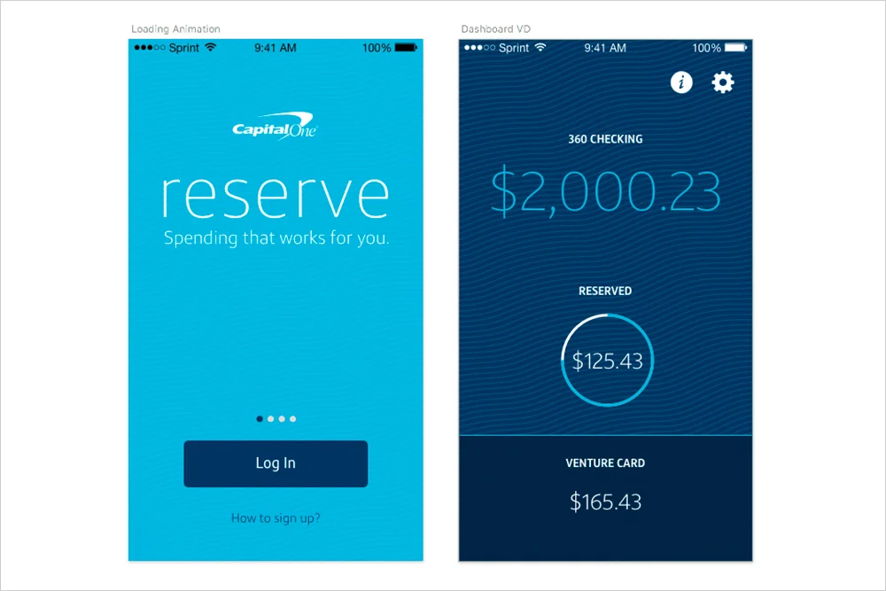
Reserve Credit App


THE ASK:
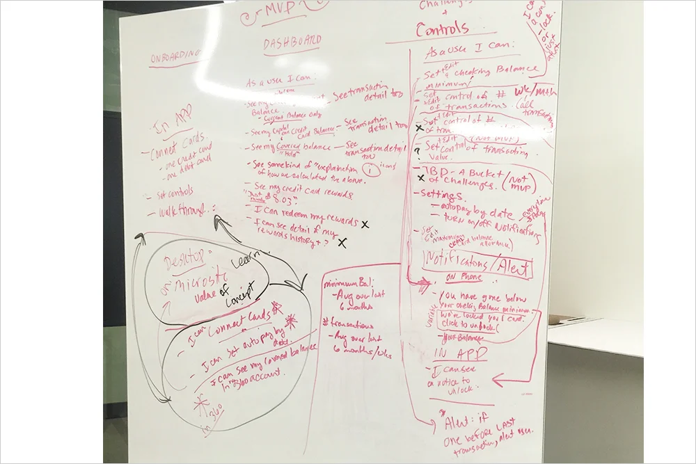
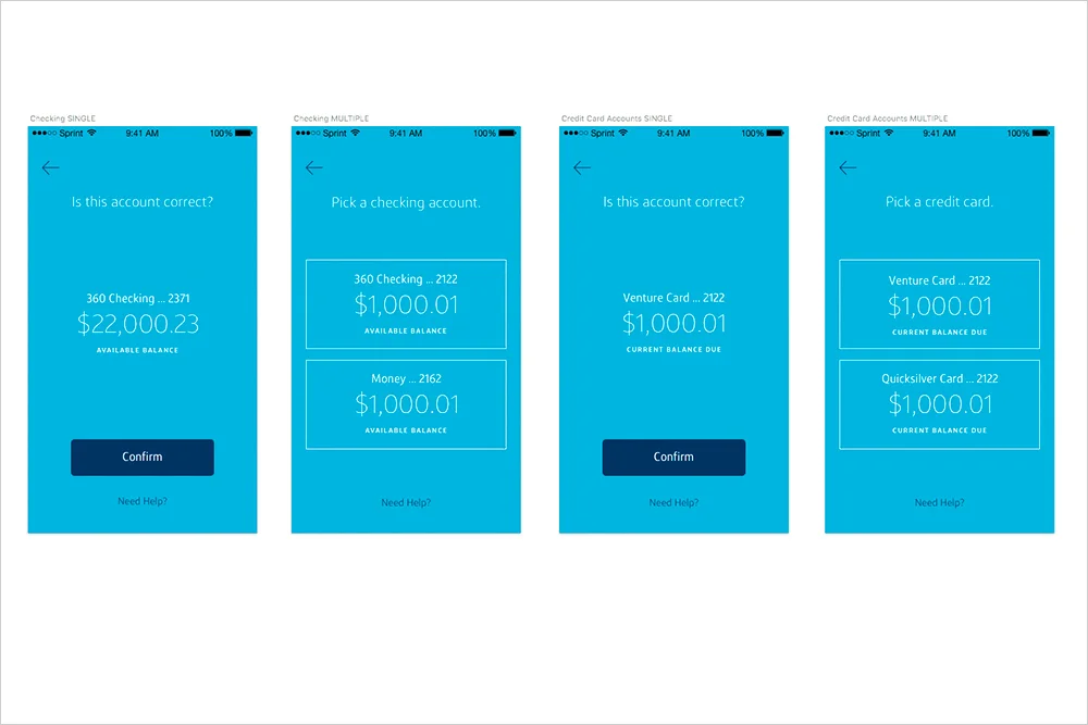
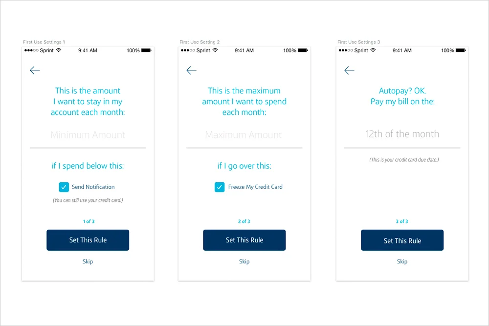
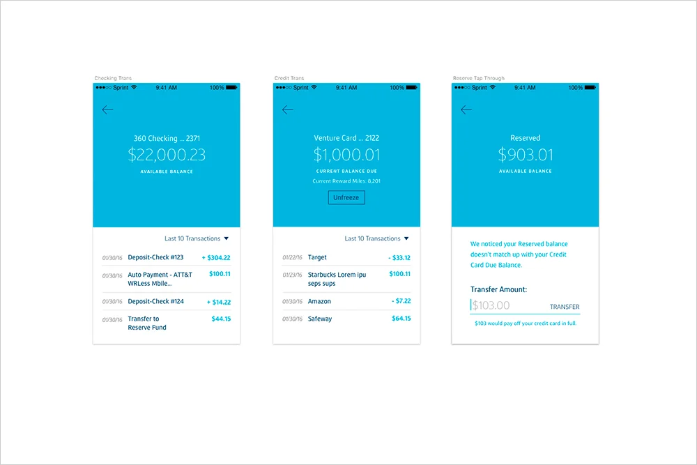
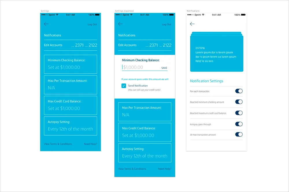
Come up with a solution to this challenge: How can we help customers improve their credit standing without getting into debt?

MY ROLE:
UX Strategy, Interaction Design, Visual Design

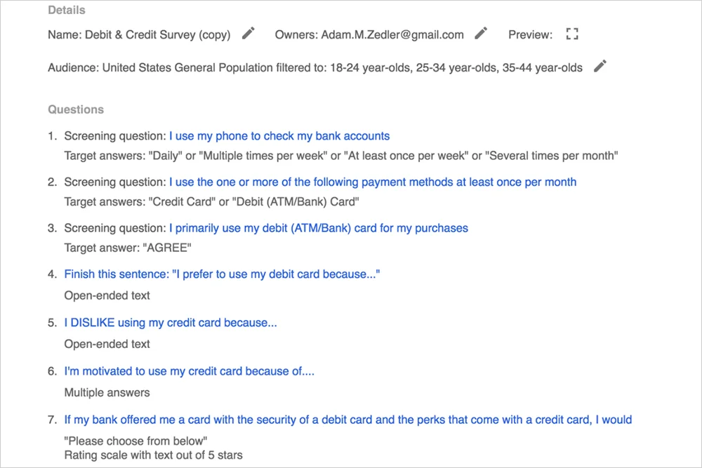
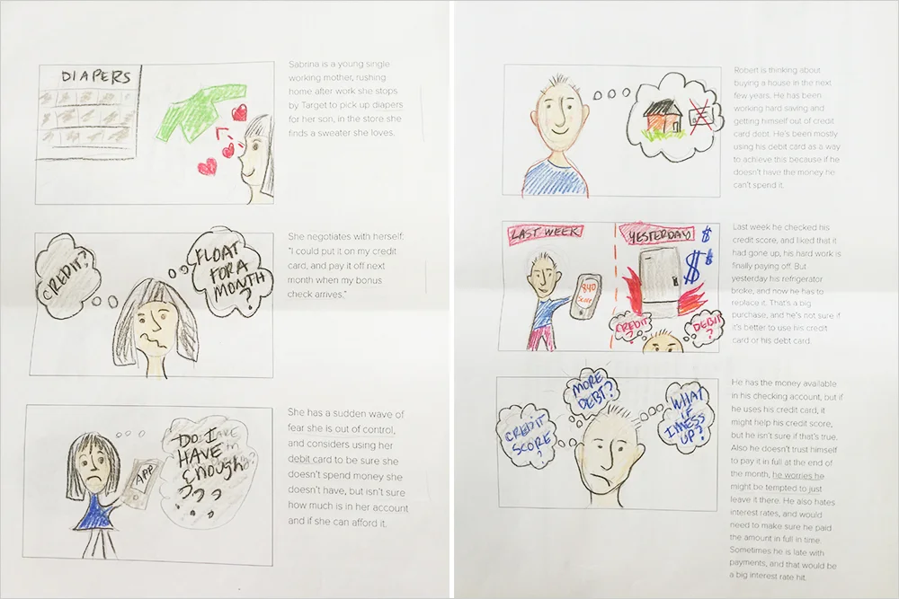
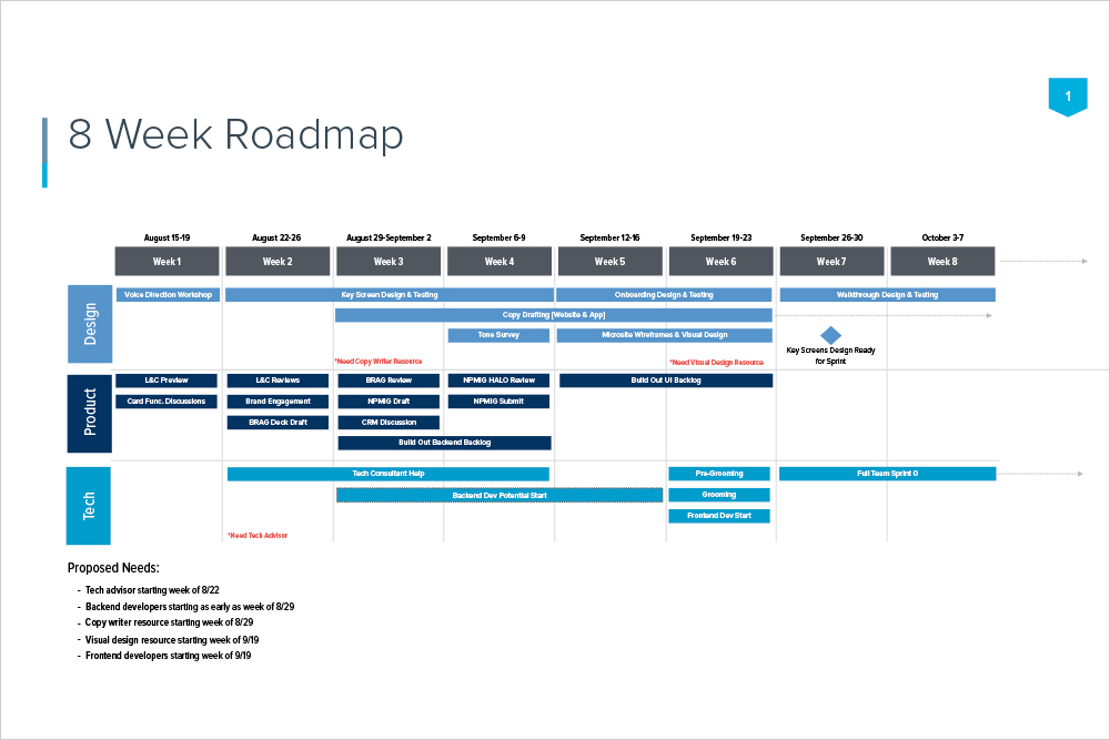
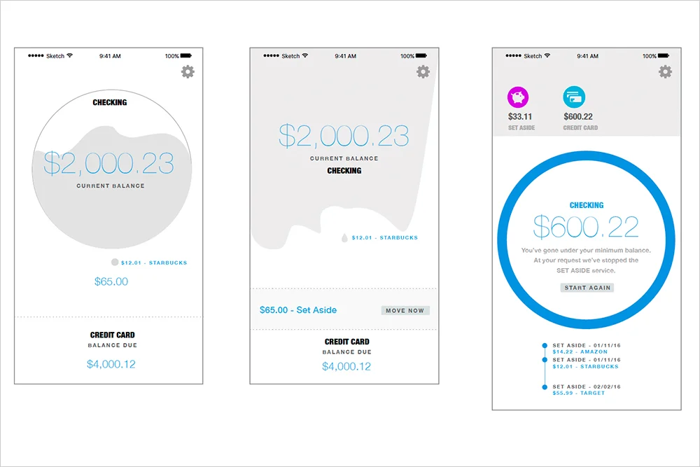
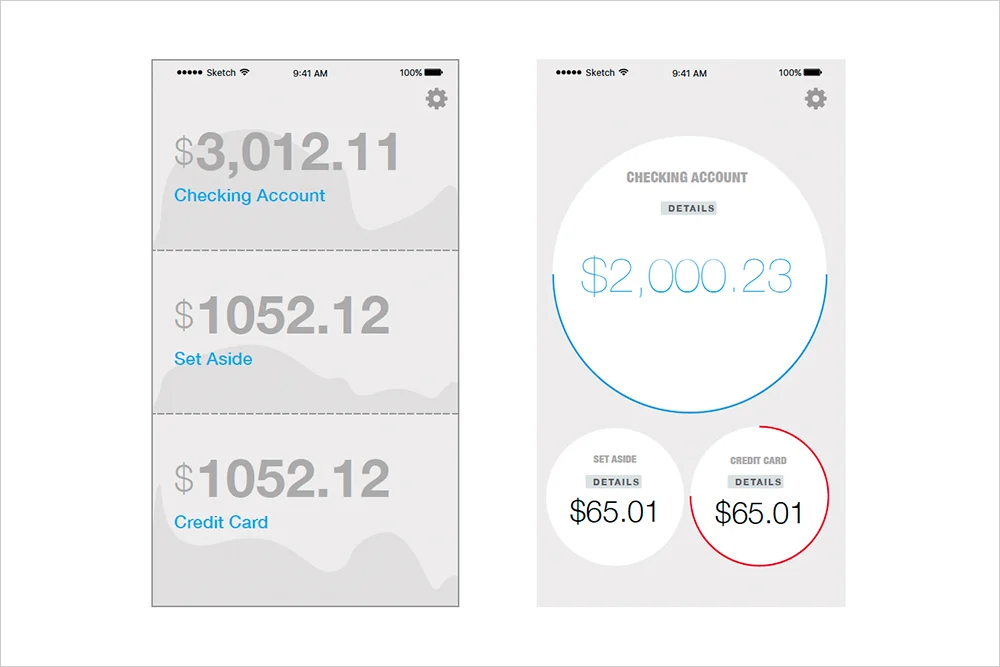
I lead research and discovery around the problem. Synthesized results, lead meetings, and brainstorming sessions until we landed on an MVP. Created decks to share with leadership team and worked with the PM to validate business value. I created low fidelity prototypes and animations which I then validated with users. I iterated on the designs and developed the art direction and created hi-fidelity mock ups.

Deep Dive PDF

R8.jpg
R1.jpg
R2.jpg
R4.jpg
R3.jpg
R5.jpg
R13.jpg
R6.jpg
R7.jpg
R9.jpg
R10.jpg
R11.jpg
R12.jpg

First Use Project


THE ASK:
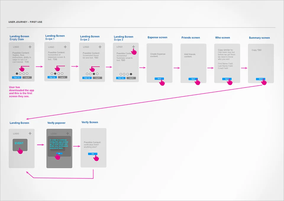
Improve adoption of the IOS app through better expectation setting during the sign up flow. 

MY ROLE:
Usability Testing, Interaction Design, Visual Design

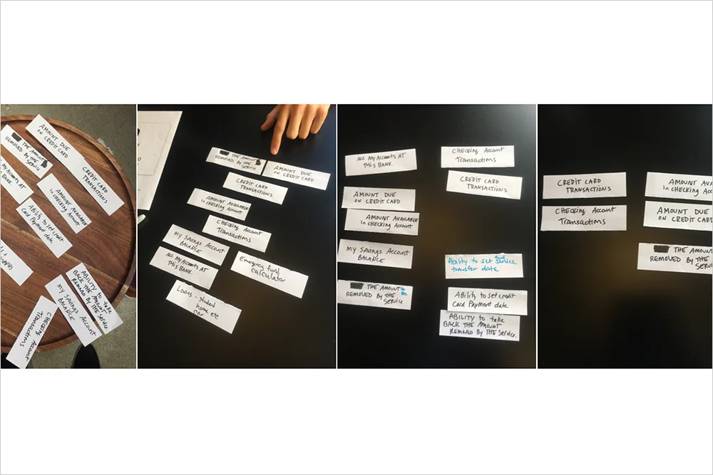
I conducted guerrilla style user interviews using a paper prototype, as well as lead several design reviews and iterations. I created the user flow, and interaction designs as well as the visual design. 

DEEP DIVE:
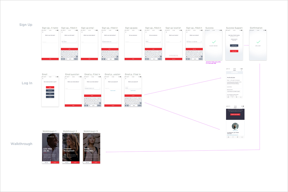
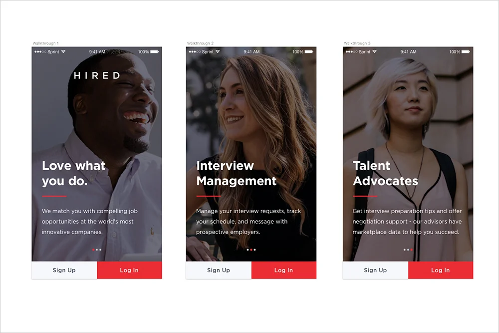
I broke the designs into three parts, in order to be able to build/execute in smaller chunks.

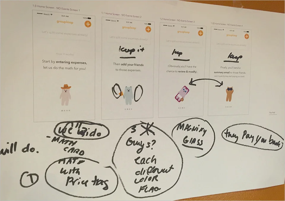
For the walkthrough screens, I decided to showcase the value prop for the three most valuable (to the user) features. I repurposed photography from a previous photoshoot. There was no time for a new one. Ideally the images would have told the story of the feature, but I made the best of the situation.

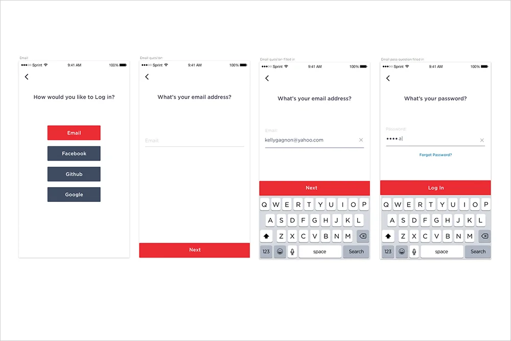
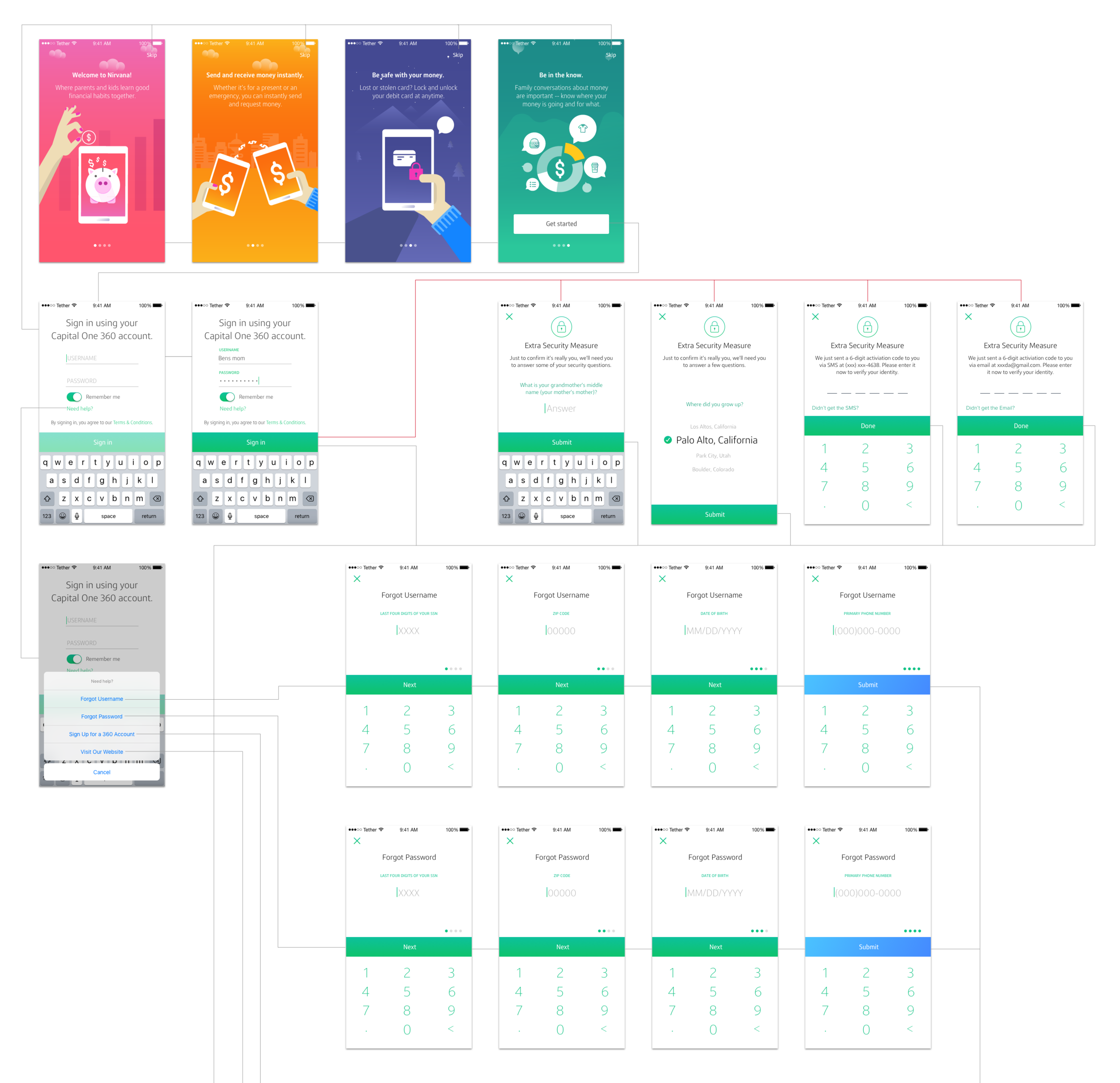
As for the log in flow, I decided to try using the method of progressive disclosure. I broke the questions down into smaller pieces, which allowed the user to focus on one task at a time. We tested this and it proved positive. "I like how clean and open it is.” My theory is because there isn’t much clutter on the screen users found it easier to use.

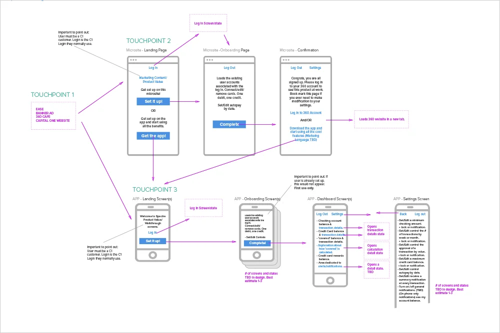
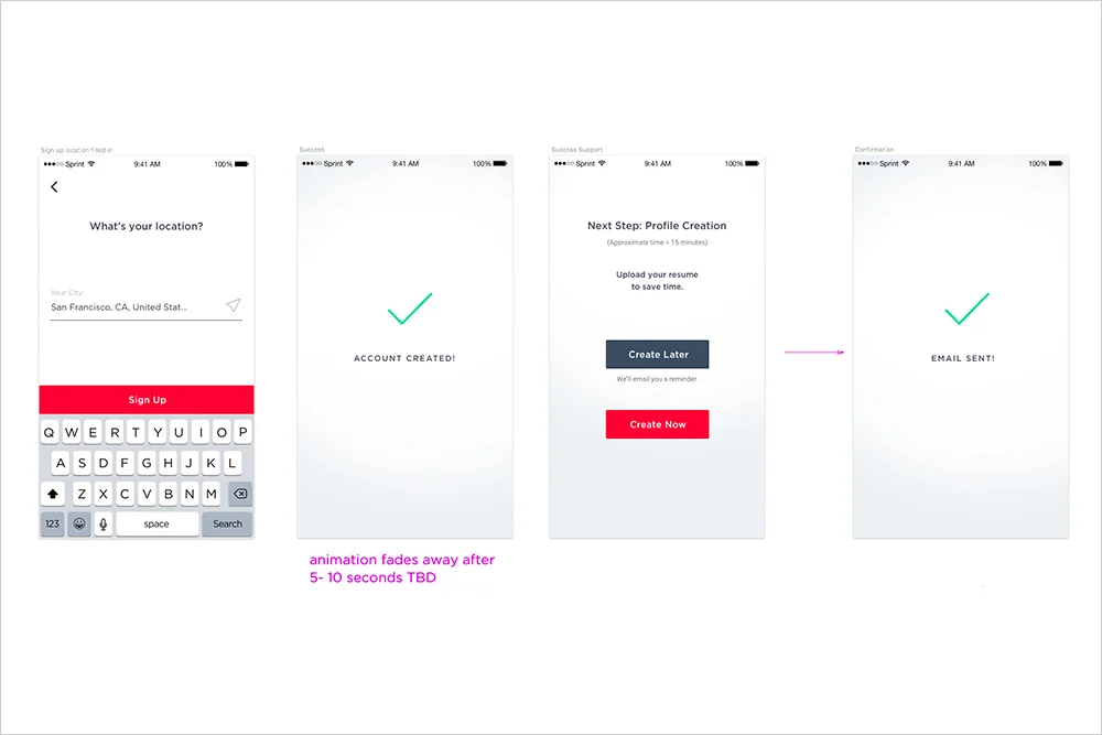
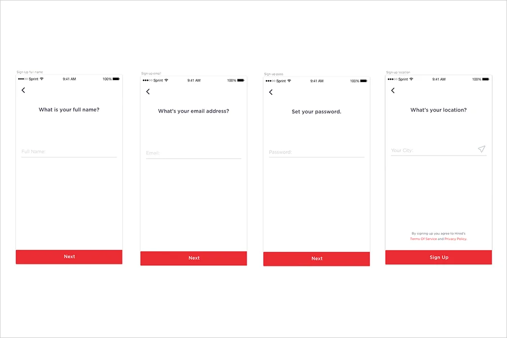
I did the same for the sign up flow. The challenge with sign up flow is the second half of the user experience is not optimized for mobile. It’s best to do this on desktop computer. So my task was to set that expectation up with the user, without creating drop-off.  I created the distinction between account creation and profile creation by adding some success feedback screens. Since account creation was a good mobile experience, I wanted to separate it from the non mobile experience.

I also added the option to create a profile now, which would be a poor experience, but not broken, and offer to send them a reminder so they could continue later when they are on their desktop.

We’re still waiting on the performance results.
2.jpg
3.jpg
1.jpg
4.jpg
5.jpg

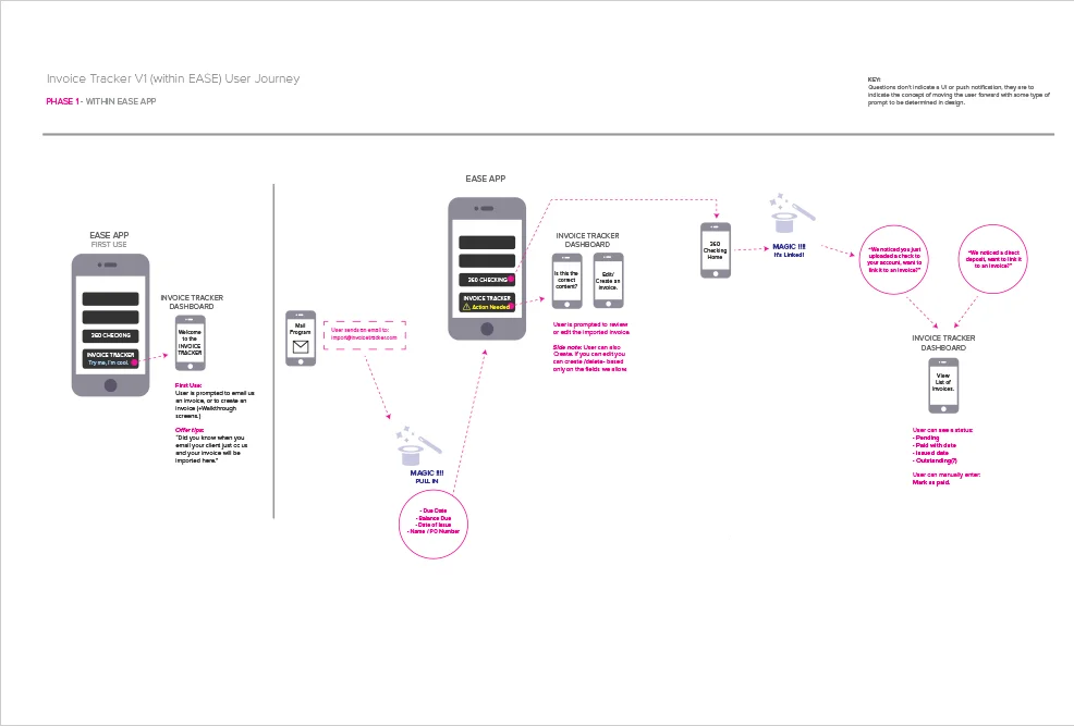
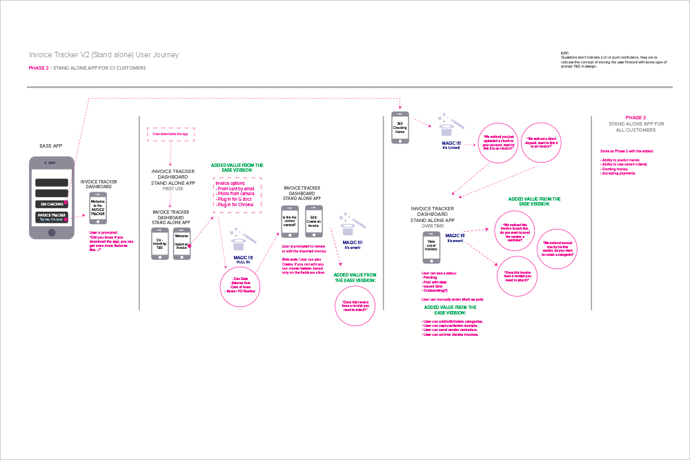
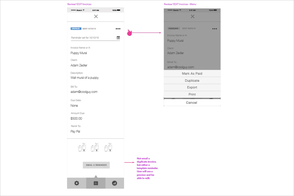
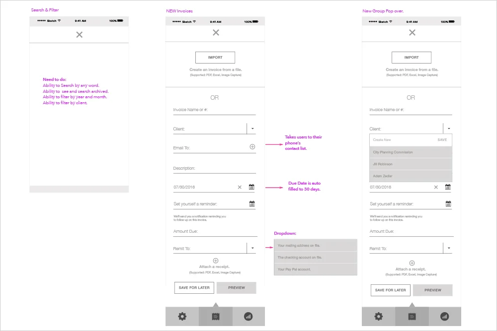
Invoice Tracker App


THE ASK:
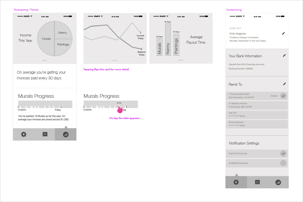
Create a tool to help self employed customers manage their receipts and invoices.

MY ROLE:
UX Strategy, Interaction Design, Visual Design

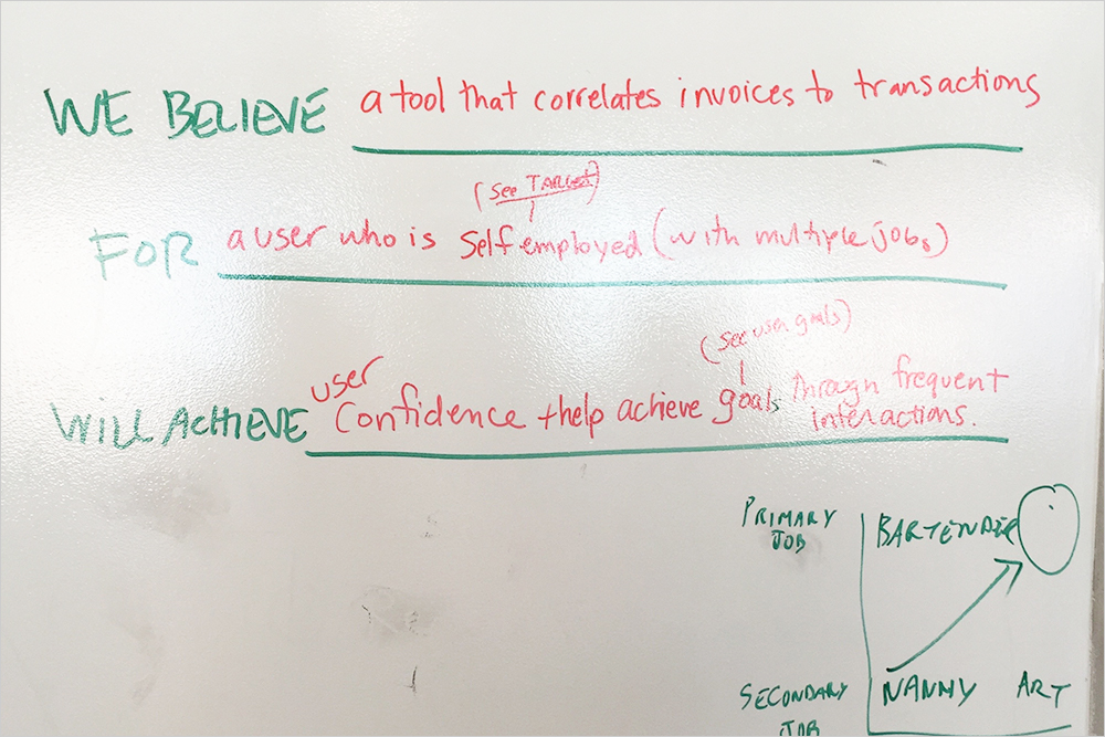
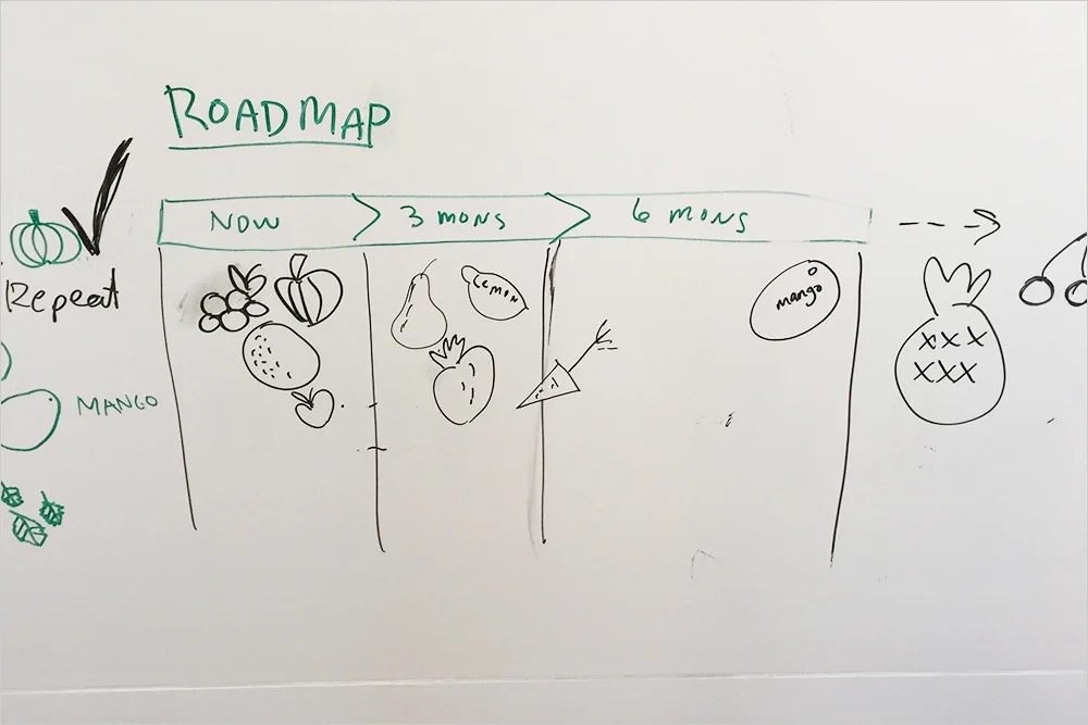
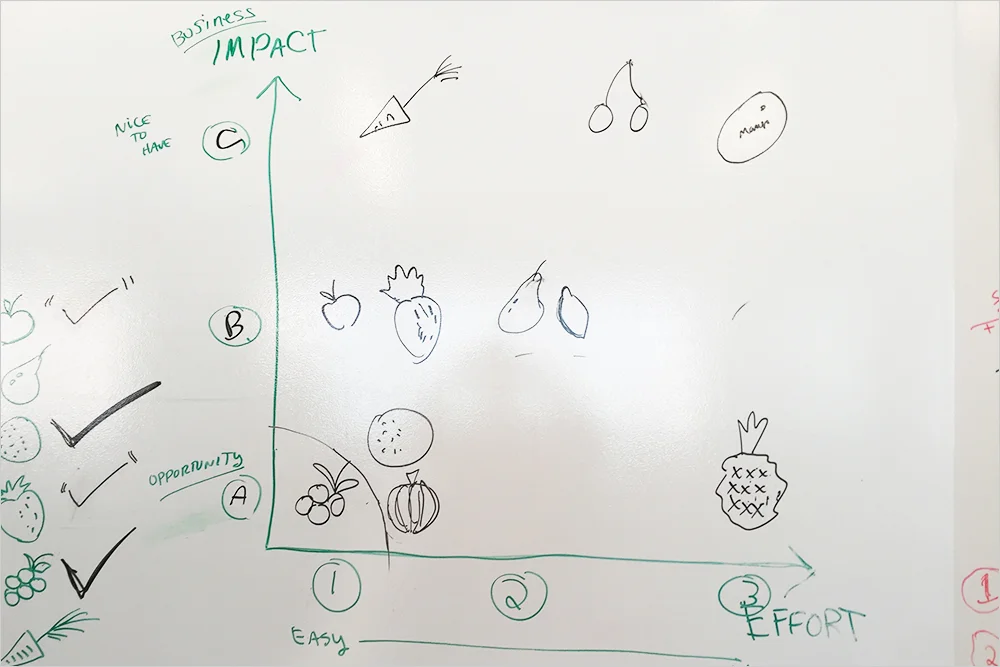
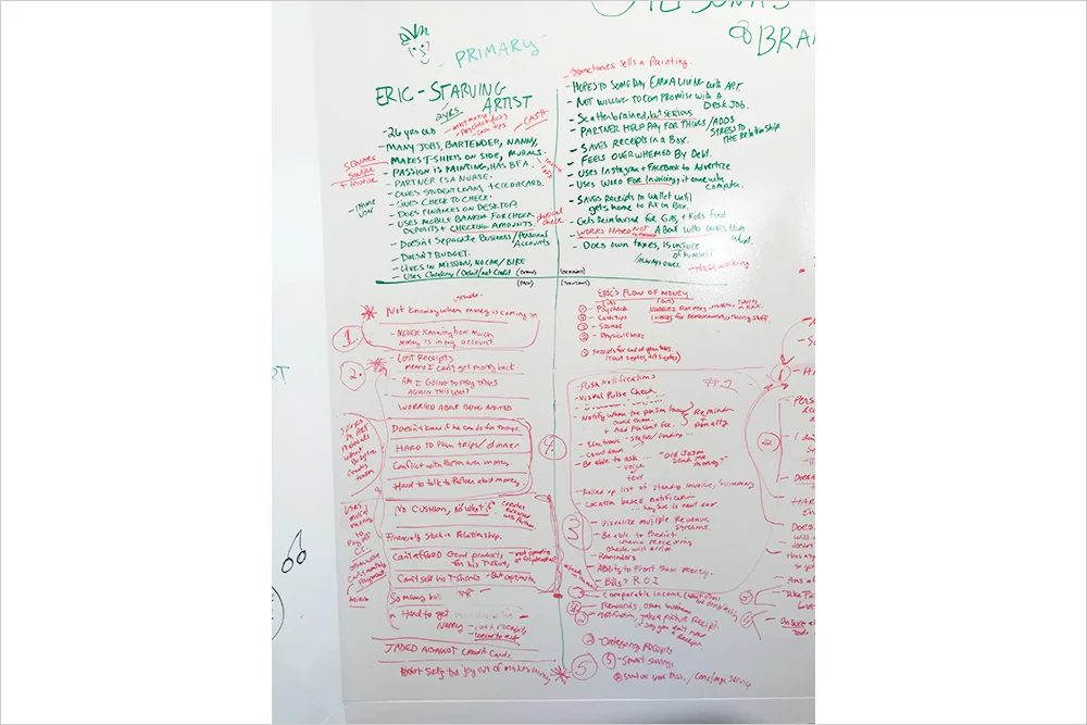
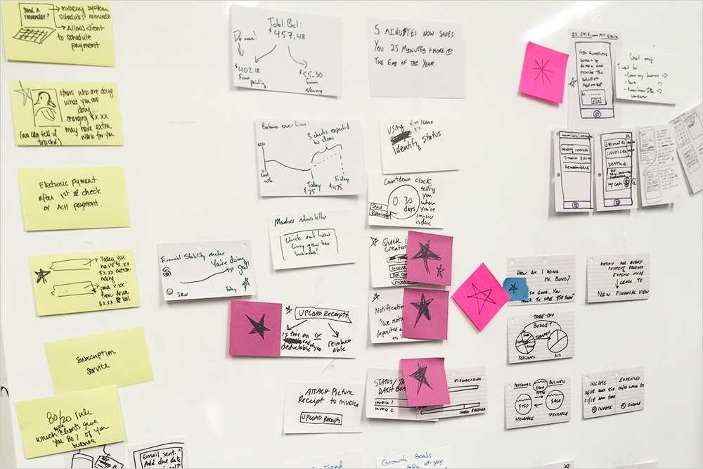
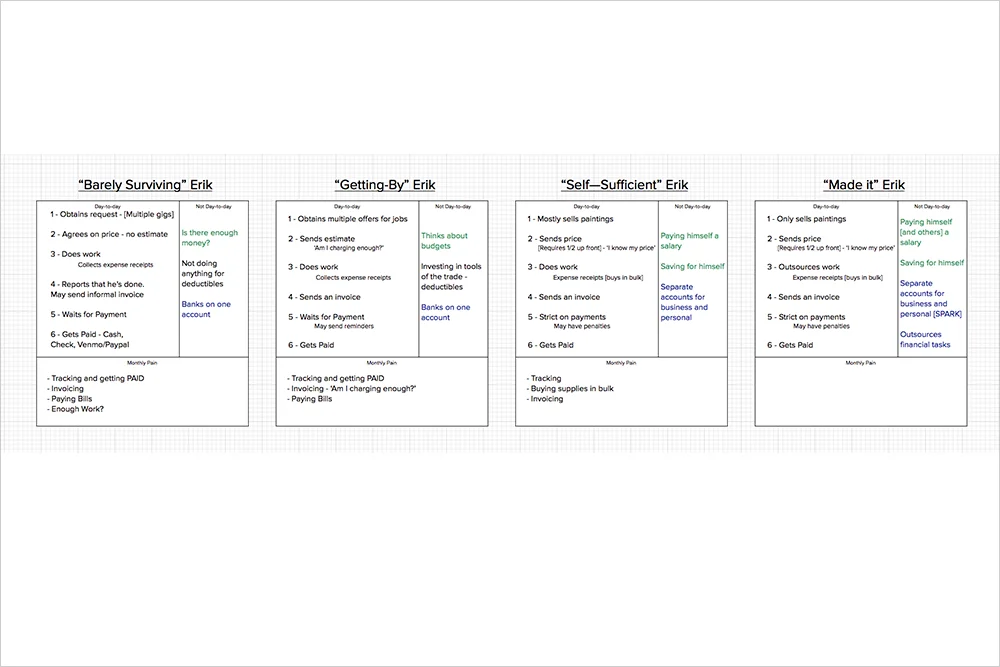
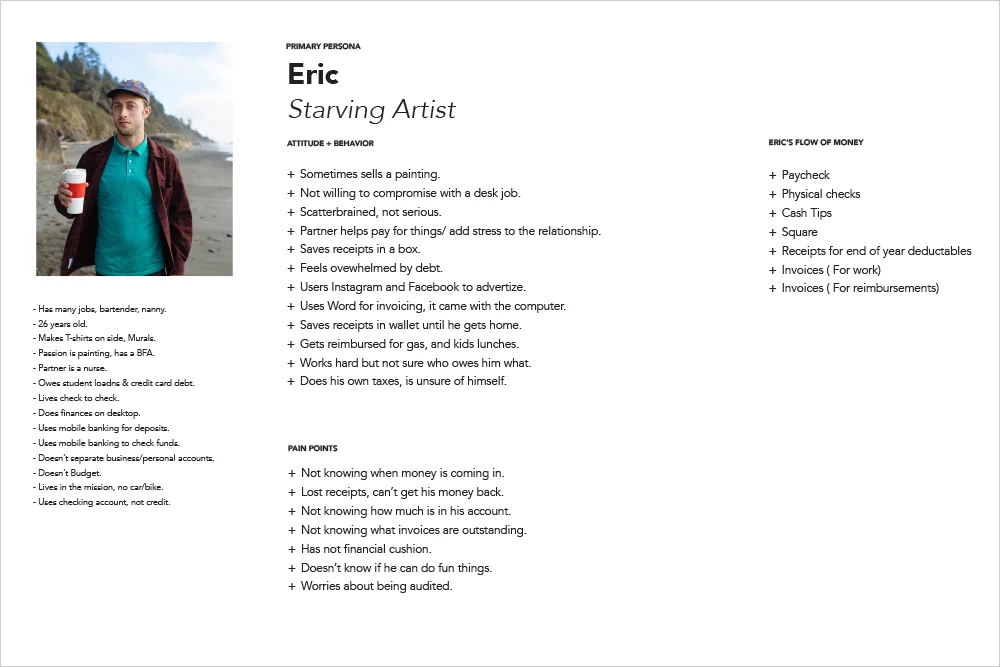
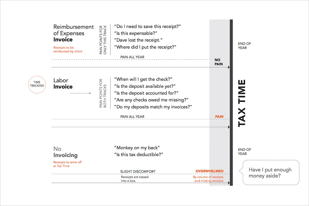
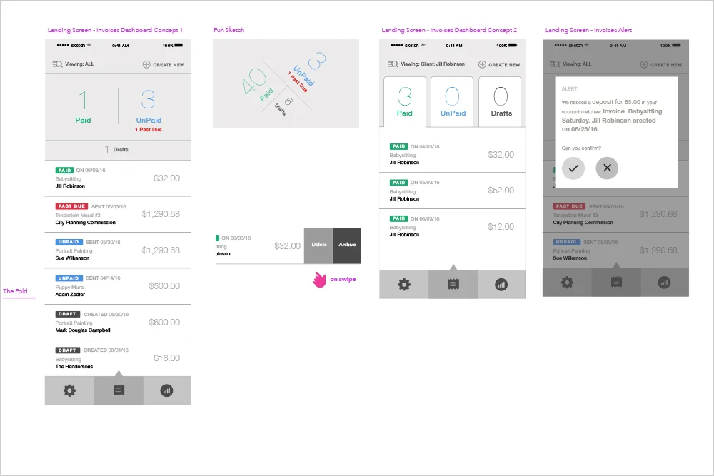
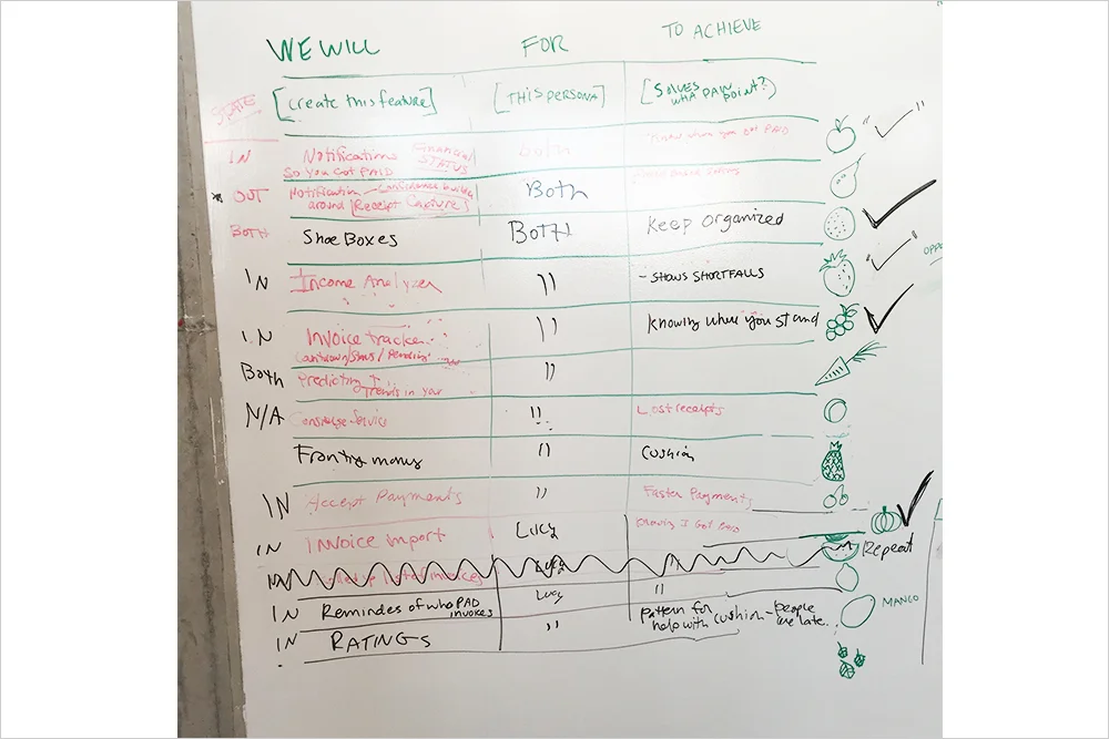
I lead the research, synthesized the findings to create a diagram that showed the problems to solve. I did this based on how the users were feeling, thinking and doing. Then I lead a strategy workshop to figure out the problem statement and audience. In that session we also created a feature list that mapped to the business impact and the effort levels. Then I roadmapped that narrowed list to a 6 month timeline. Once the team was aligned, I created 2 different ecosystem solutions, a phase 1 and a phase 2. I created the interaction designs and the visual designs. 

This project was canceled due to org restructuring. 

g12.jpg
g1.jpg
g5.jpg
g6.jpg
g7.jpg
g8.jpg
g9.jpg
g10.jpg
g4.jpg
g11.jpg
g2.jpg
g3.jpg
g13.jpg
g14.jpg
g15.jpg

Interview Request Project


THE ASK:
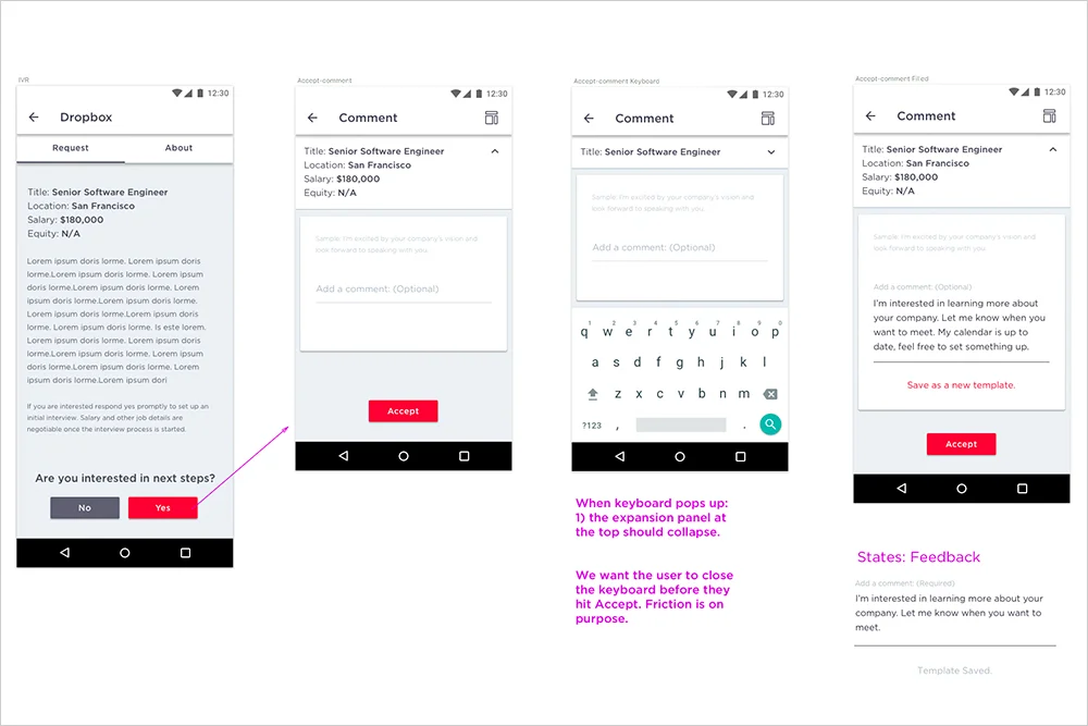
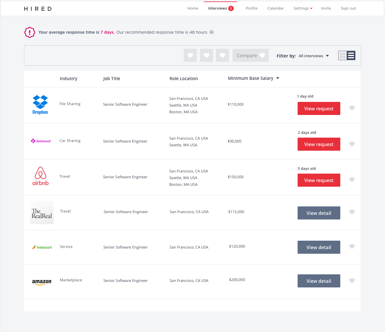
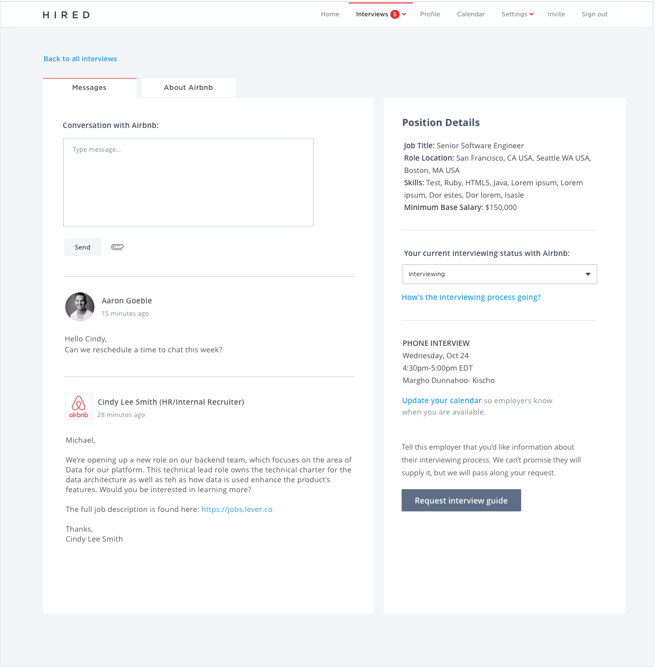
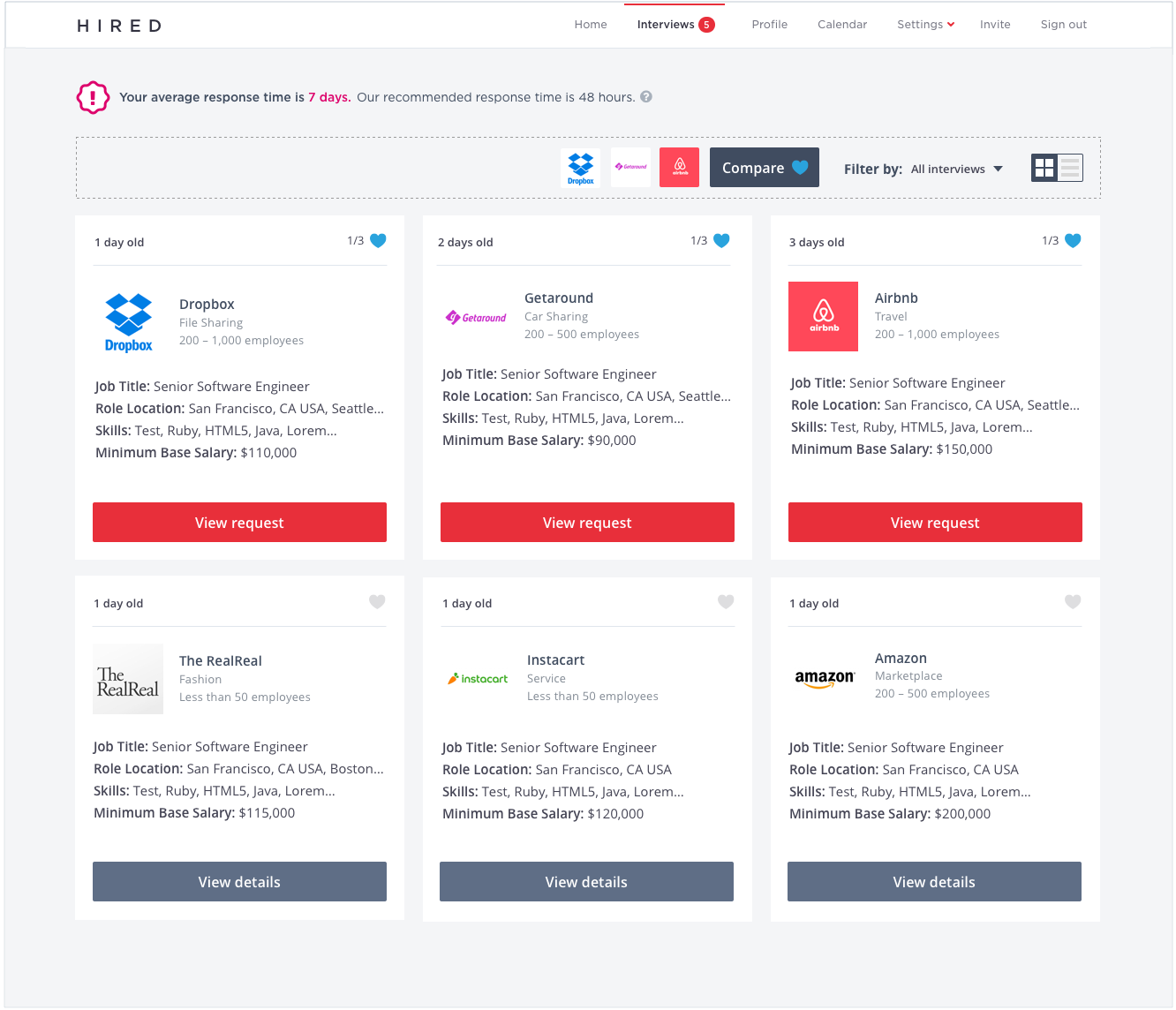
Redesign the interview request flow to improve acceptance rates in the Android App.

MY ROLE:
UX Strategy, Interaction Design, Visual Design

I synthesized the research findings and created a list of recommendations to get leadership buy in. I created the interaction designs and the visual designs. 

DEEP DIVE:
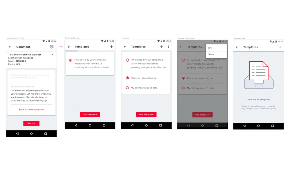
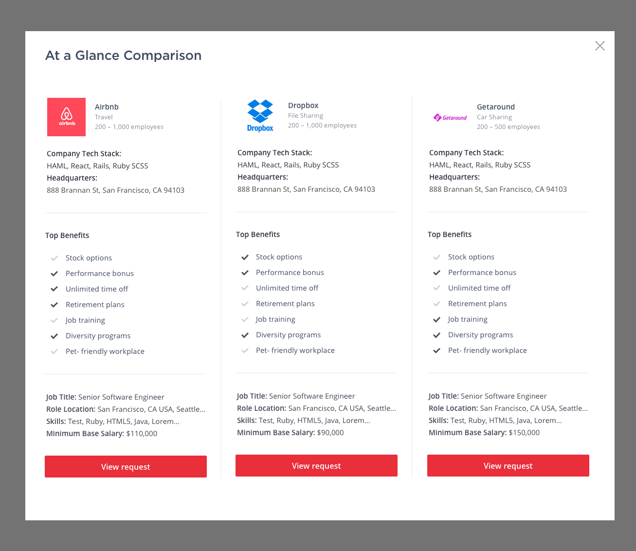
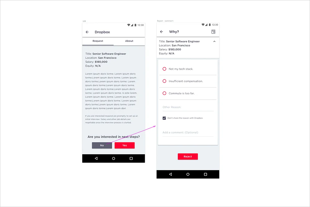
In talking to users we discovered one of the key themes in making a decision to accept or reject an interview is information about the company. So I proposed to add the about tab to the flow, as well as an expand/collapse card with the top position details. I also created a design that gave users templates in order to make answering the request easier. (Users have told us they get stuck thinking: What should i write.) 

This has shipped, we’re still waiting on performance results.
 

a3.jpg
a2.jpg
a1.jpg

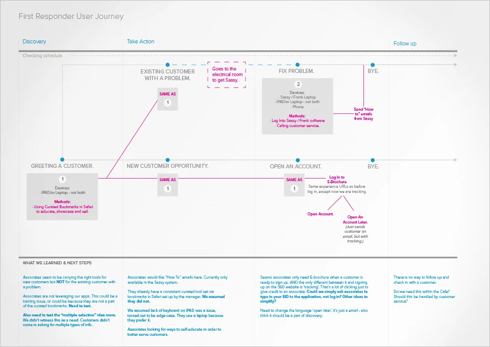
360 CAFE APP


THE ASK:
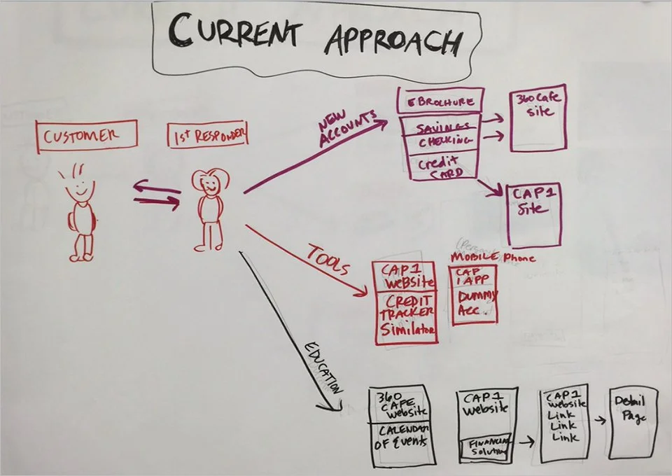
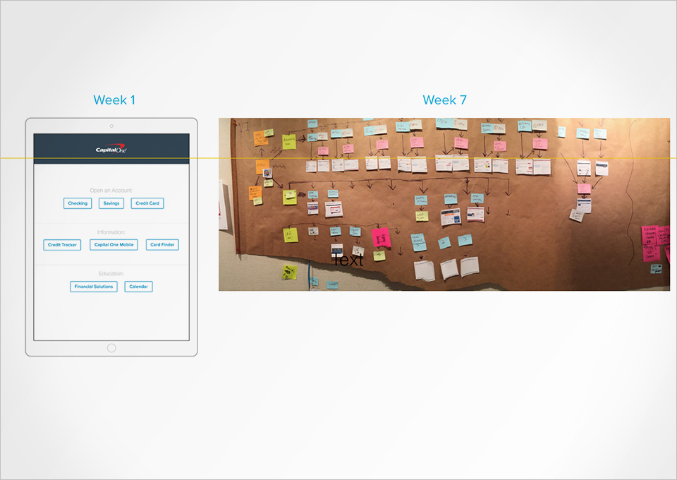
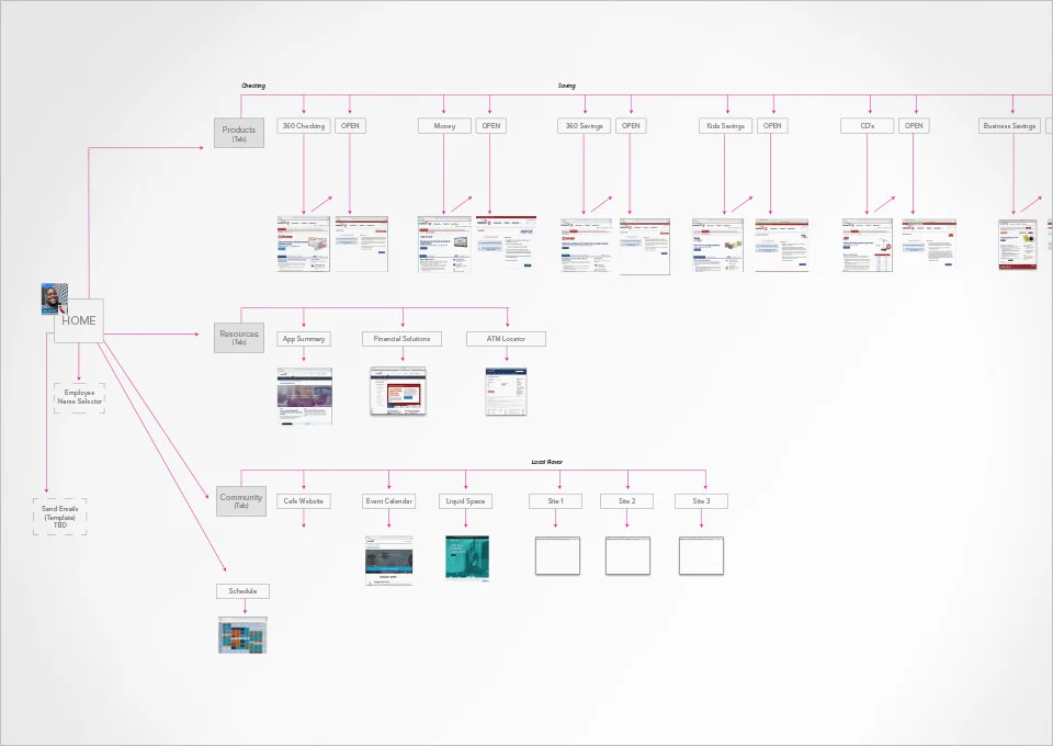
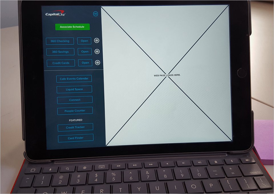
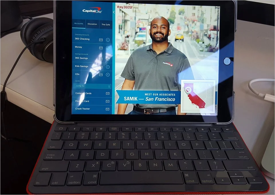
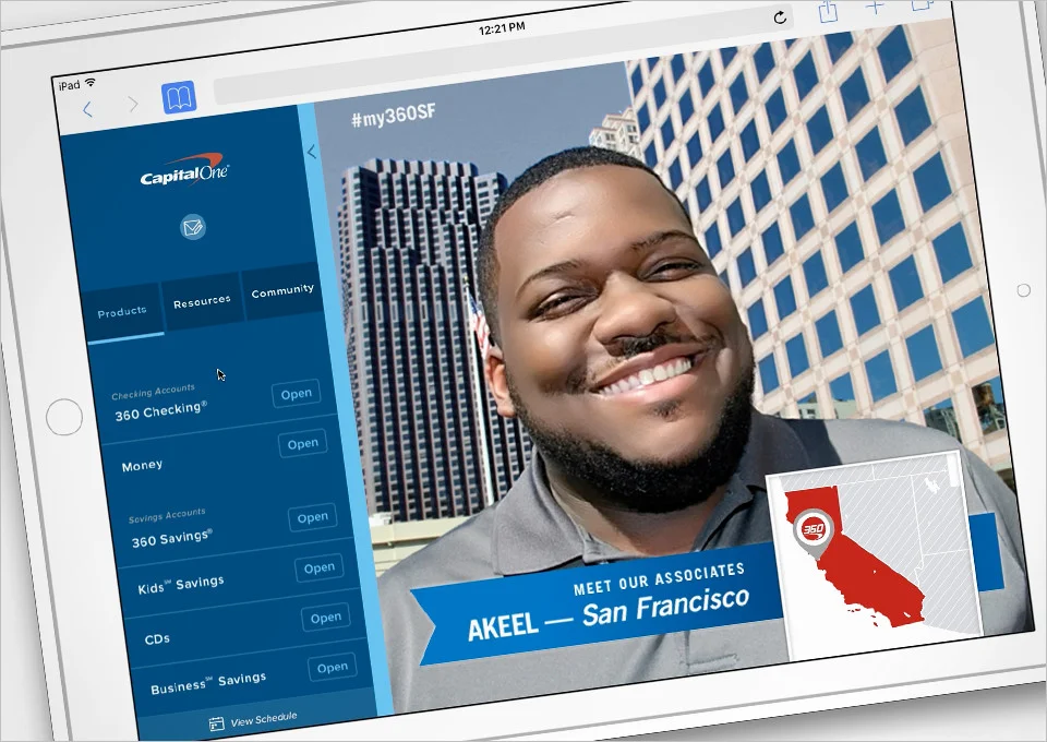
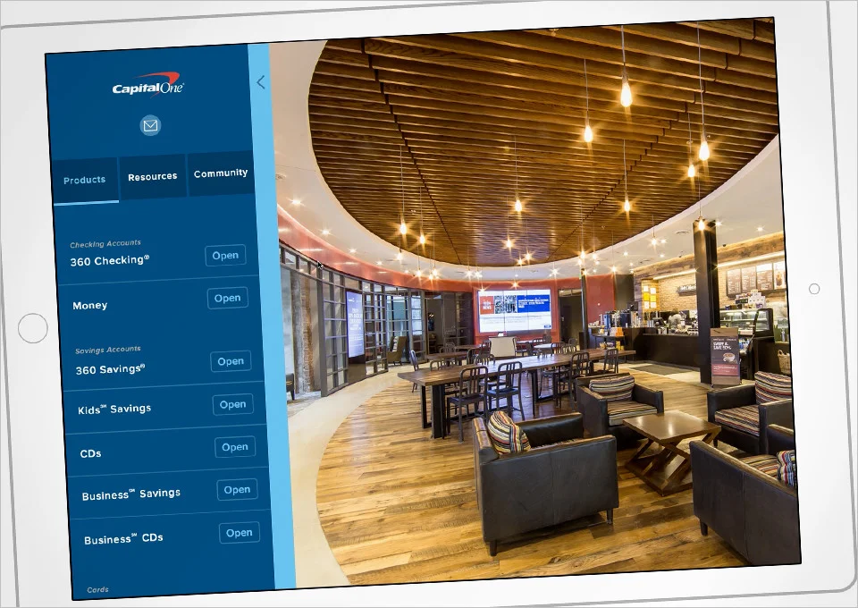
Bring together an existing app, local info, and education widgets
into one resource/device for the 360 Cafe Associates.


MY ROLE:
Research, UX Strategy, Interaction Design, Visual Design

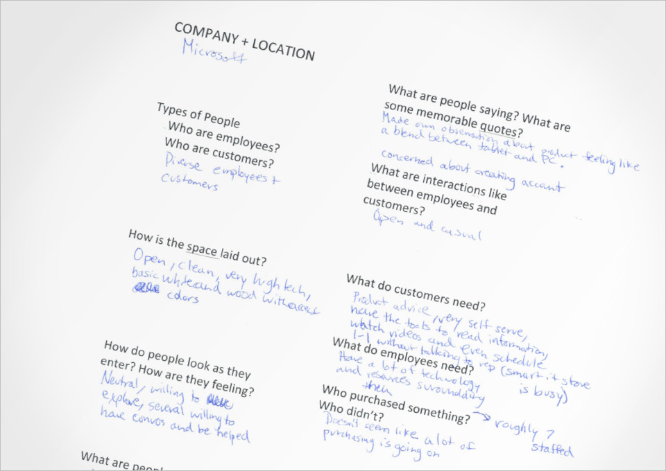
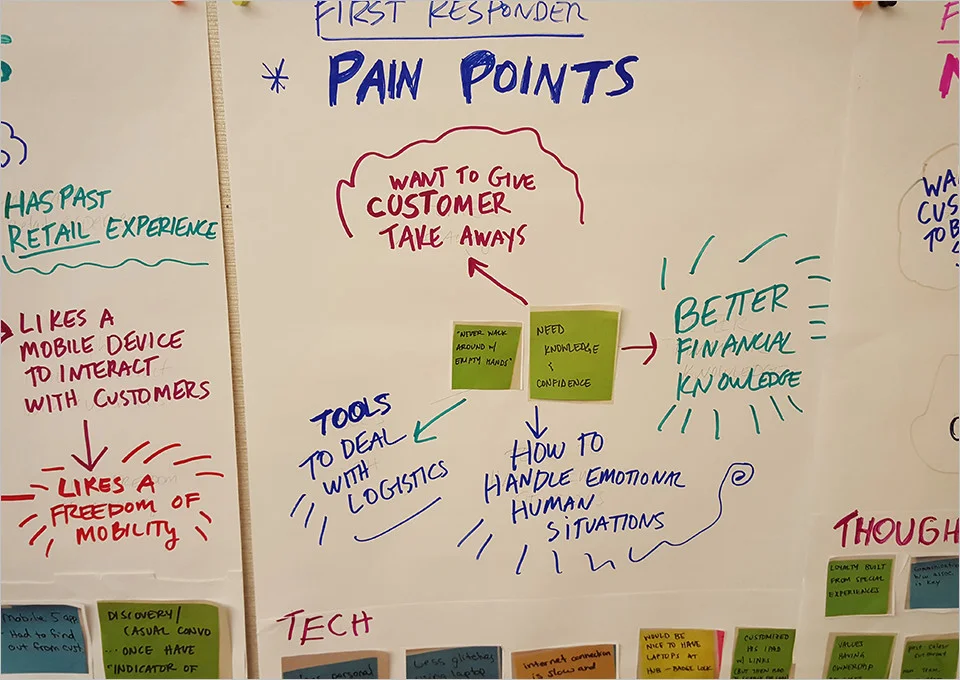
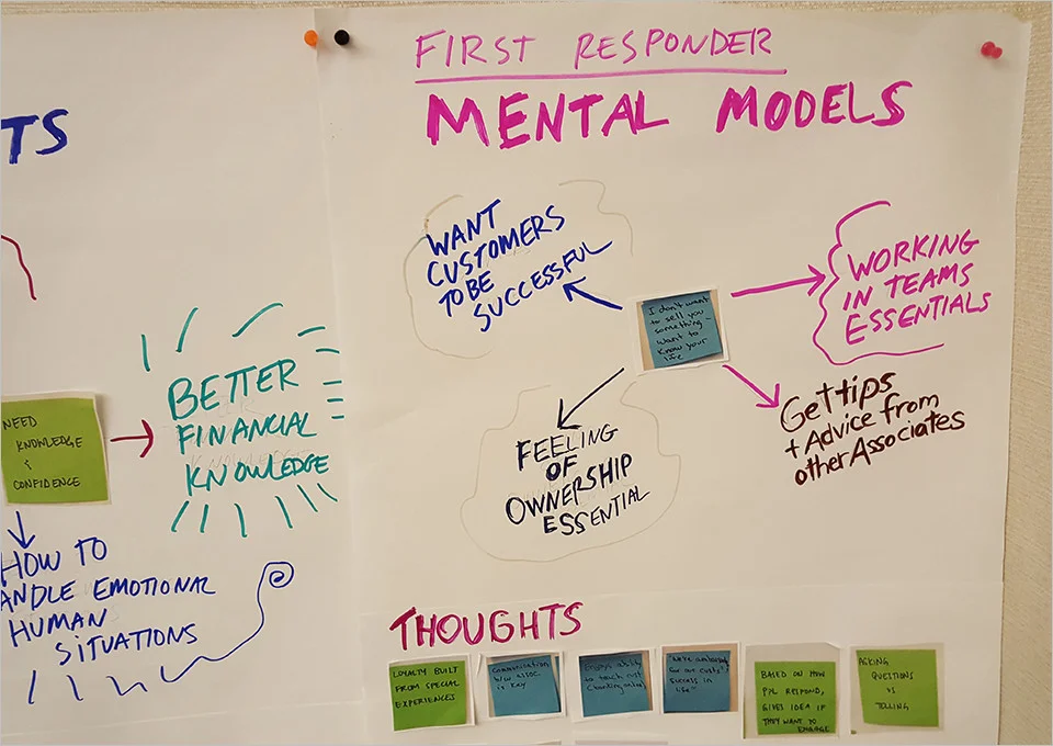
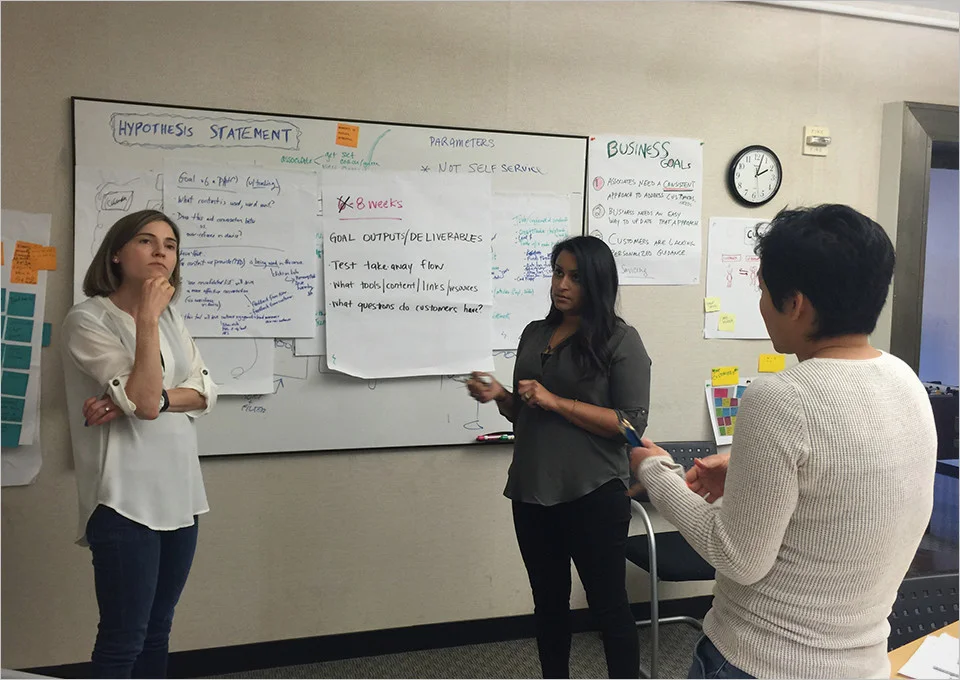
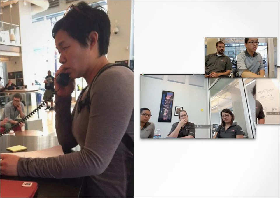
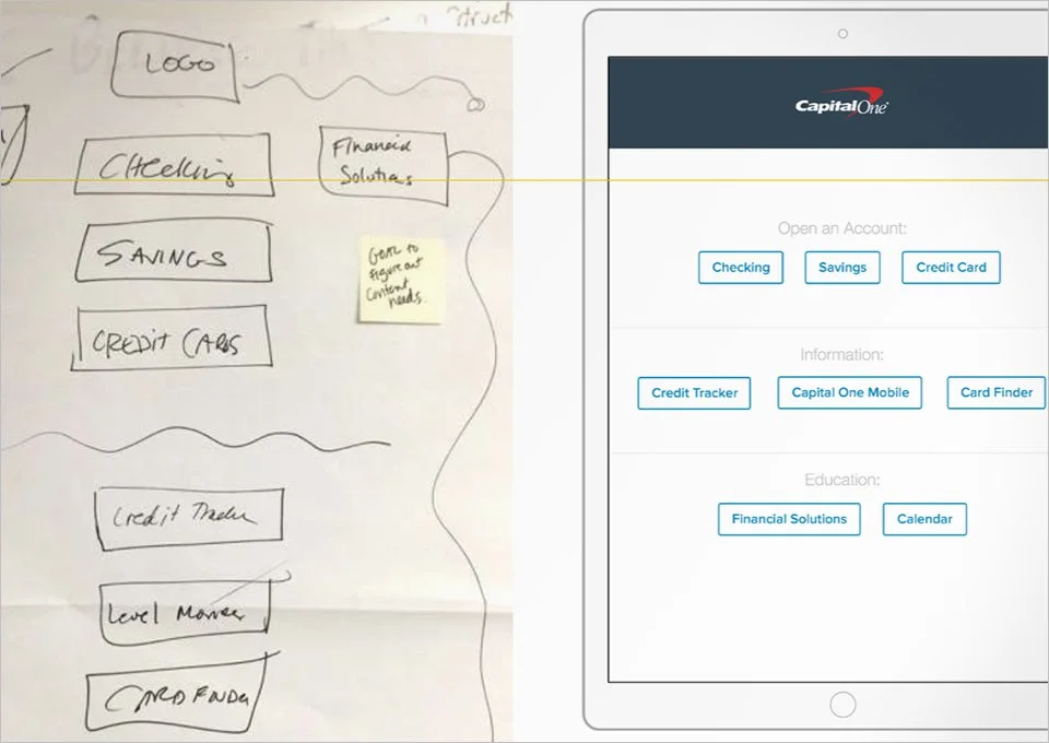
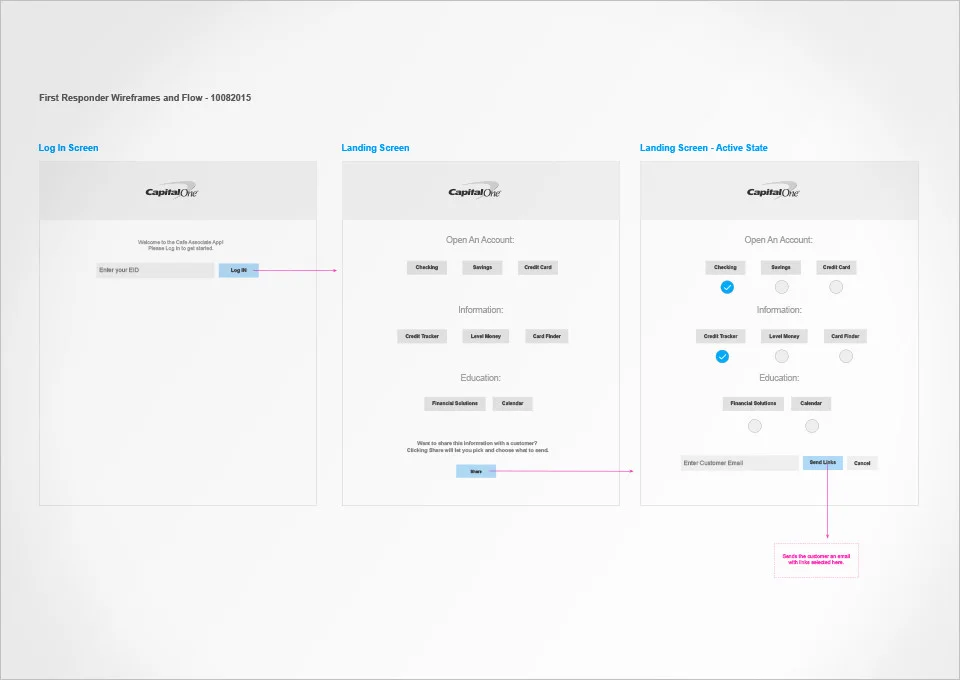
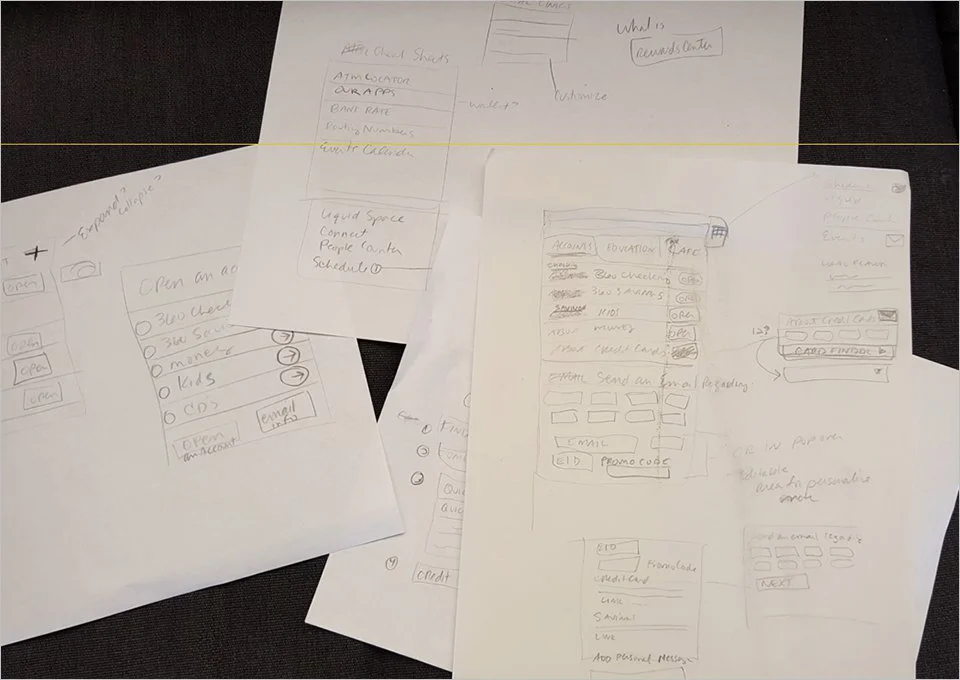
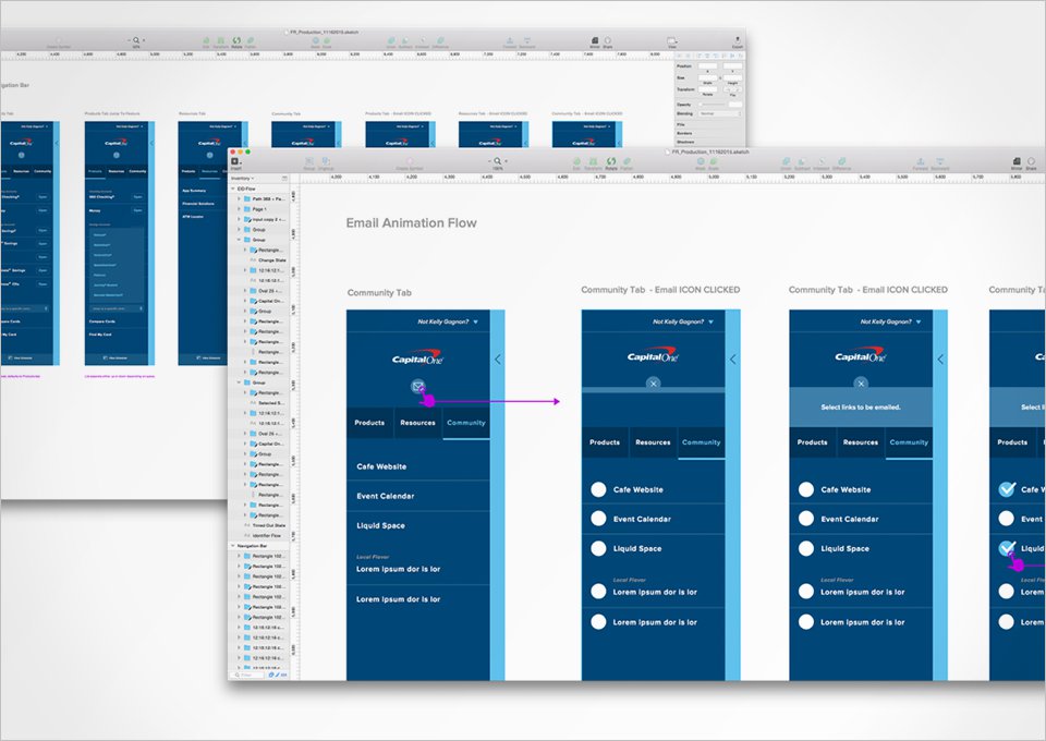
I lead moderated research, was the workshop facilitator, as well as the information architect. I created sketches, personas, user flows, and hi-fidelity mockups. I iterated weekly with moderated user testing embedded in each design sprint for 10 weeks.

Then we ran a pilot prototype in the San Francisco Cafe. 

Deep Dive PDF

download copy 19.jpeg
download copy.jpeg
download copy 2.jpeg
download copy 3.jpeg
download.jpeg
download copy 4.jpeg
download copy 5.jpeg
download copy 6.jpeg
download copy 7.jpeg
download copy 8.jpeg
download copy 9.jpeg
fr3.jpg
FR12.jpg
download copy 16.jpeg
download copy 17.jpeg
download copy 10.jpeg
download copy 13.jpeg
download copy 14.jpeg
download copy 15.jpeg
download copy 18.jpeg

Jabba Interview App


THE ASK: 
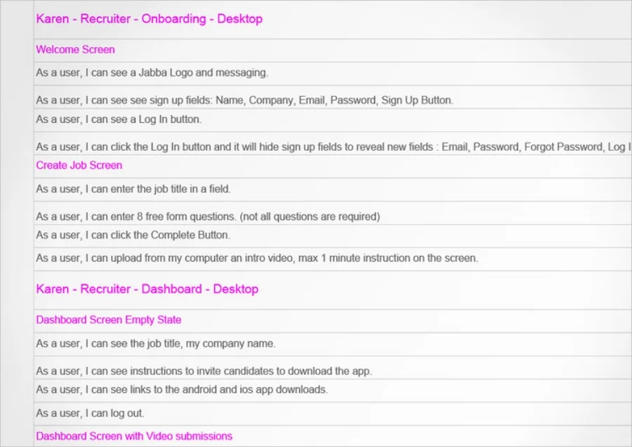
Create a management tool for recruiters who deal with high turn over employees. (i.e. seasonal) This tool helps facilitate the reviewing, tracking and hiring of candidates.

MY ROLE:
UX Strategy, Interaction Design, Visual Design

I lead a UX strategy workshop which included, problem definition, proto personas, user journeys and user stories. I also lead the interaction design and art direction.

DEEP DIVE:
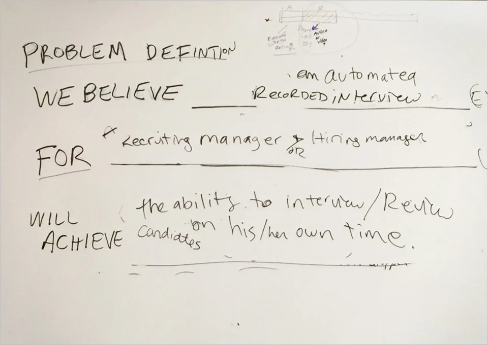
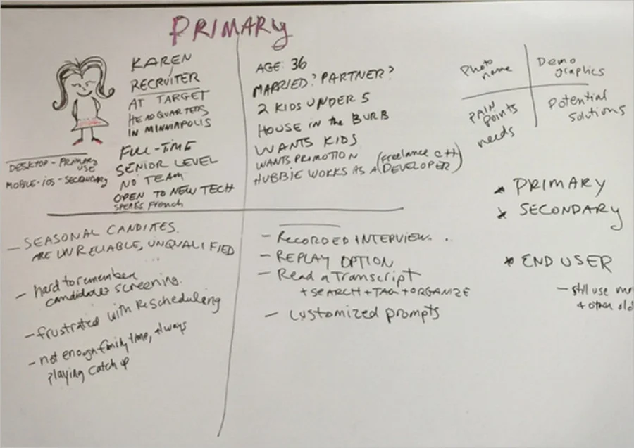
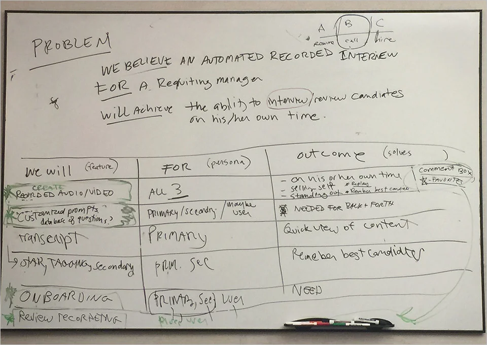
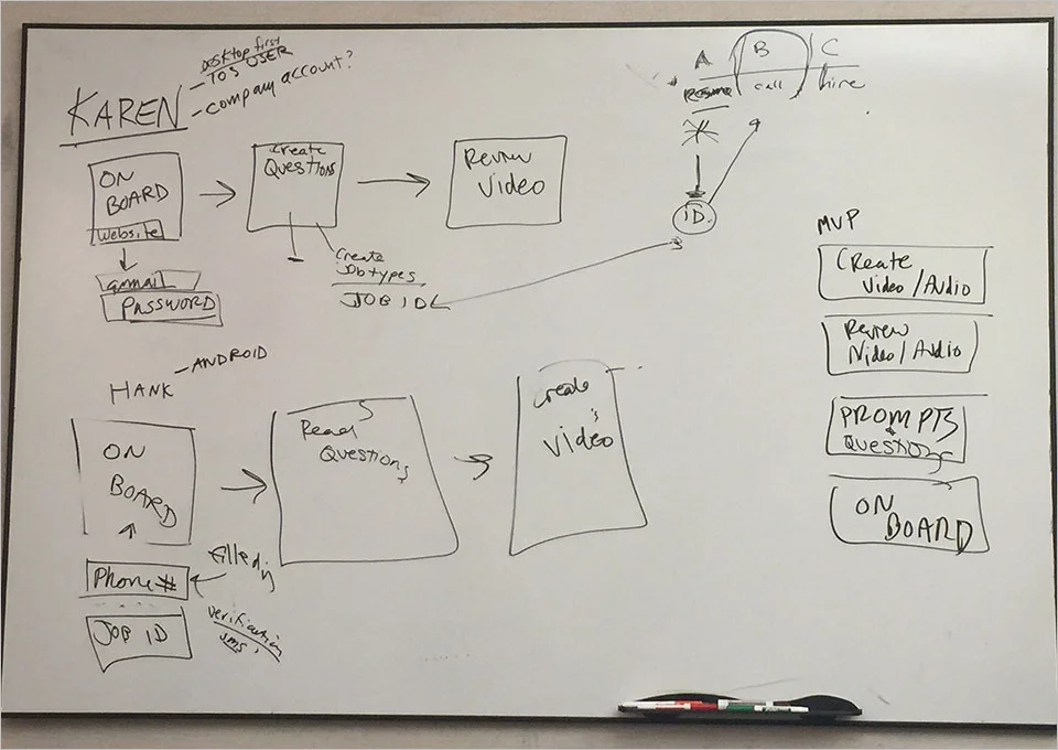
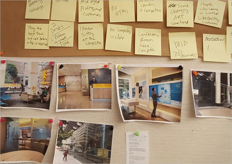
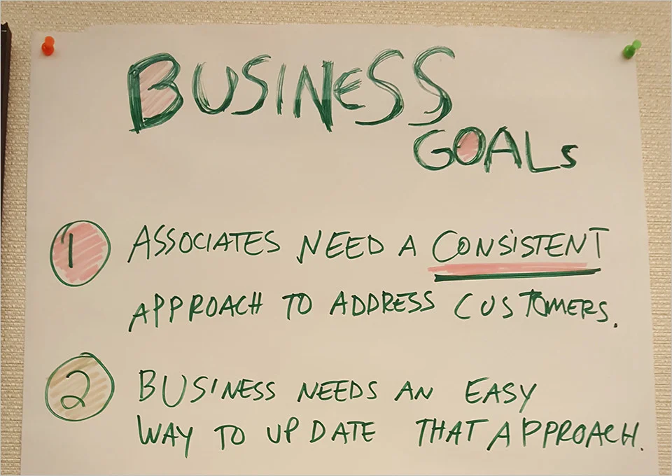
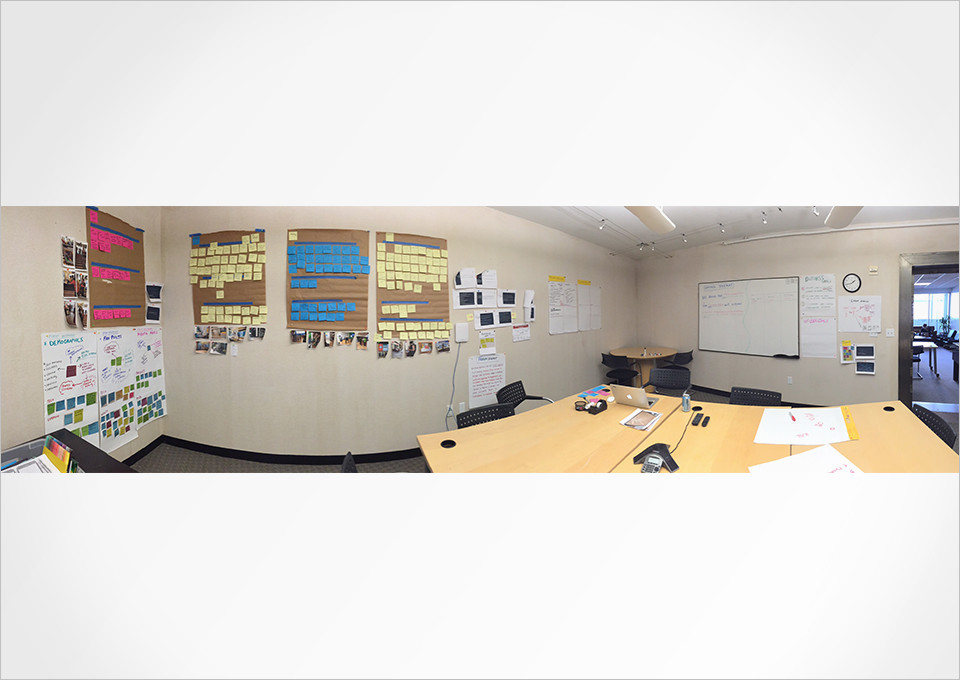
Product kickoff began with a strategy workshop that I lead. Key team members, product manager, strategy, designers and developers spent the day working together with a goal of creating a shared vision and an MVP. I started with a problem statement. Next the team tackled a primary persona, and a secondary persona. I wanted to answer the question, who is this for? I used the 4 quarters method, which includes pain points for each persona, and ideation/solutions that solves those pain points. Next I mapped those solutions, feature ideas to the personas. If a feature solved the pain points for more than one persona it's priority went up. This created a user centric design approach to the product. Then together we tackled a few user journeys and a rough MVP. Together we wrote user stories, and started weekly sprints. All flows and UI were done as wireframes, while look and feel were applied later. 
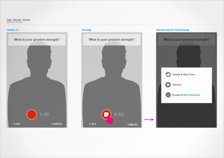
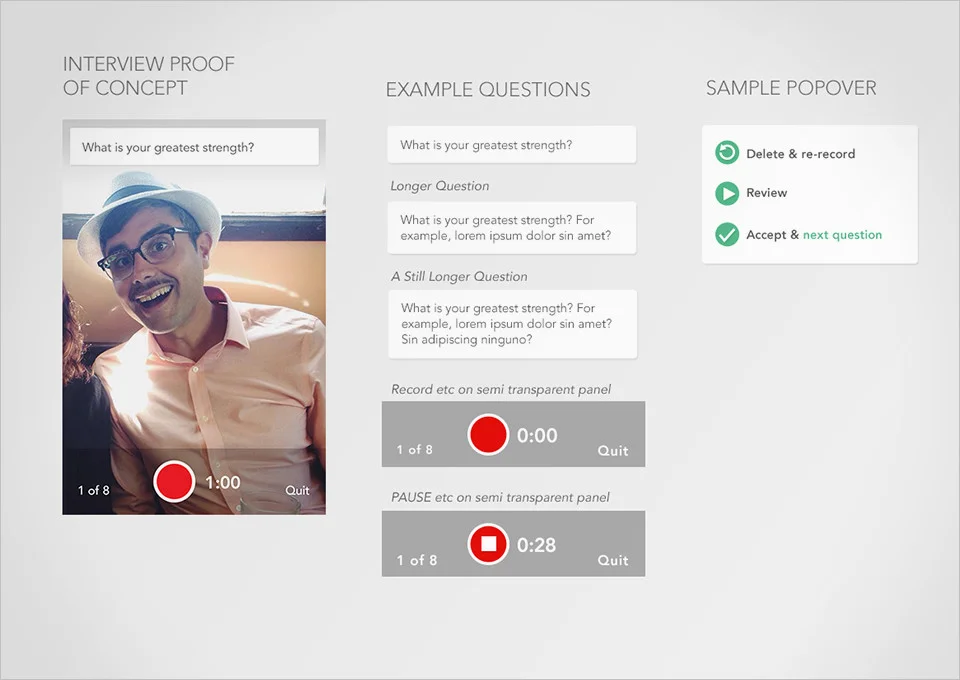
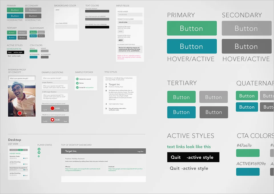
The sprints were happening independent of the component sheet. I approached it this way: Use the wireframes and flow diagrams to answer, how does this work? and what componants are to be used? Then colors/fonts/spacing were applied using a style guide. I did not create pixel perfect visual design comps for each screen. We used a weekly sprint cadence for 6 weeks then shipped it to the Apple store for a total of 8 weeks from strategy to ship.
 

download copy 7.jpeg
download.jpeg
download copy.jpeg
download copy 2.jpeg
download copy 3.jpeg
download copy 4.jpeg
download copy 5.jpeg
download copy 6.jpeg

GroupLoop Expenses App


THE ASK: 
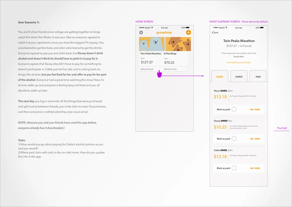
Create a mobile app experience which makes it easier for people who are splitting expenses to manage the hassle of settling the bill.


MY ROLE: 
Usability Testing, Interaction Design, Visual Design

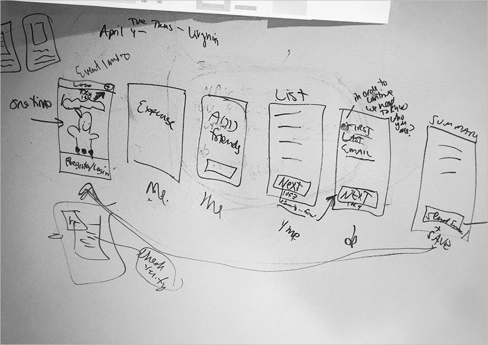
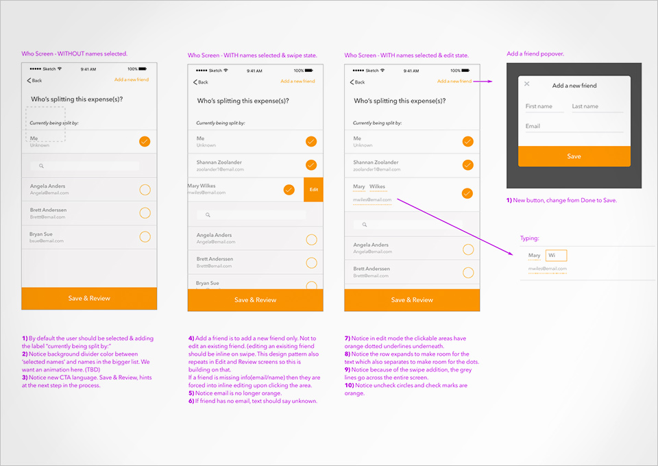
I came on to this product later in it’s lifecycle. The product already existed, my role was to make improvements to what was there. I lead many whiteboard sessions, created new interaction design patterns on 2 projects, and lead moderated user testing sessions.

DEEP DIVE:
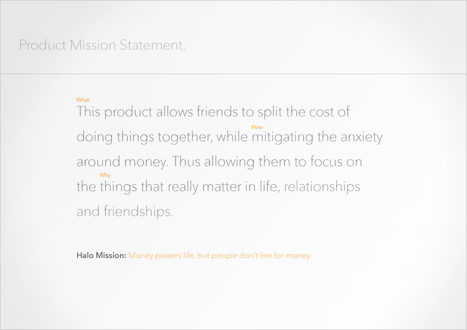
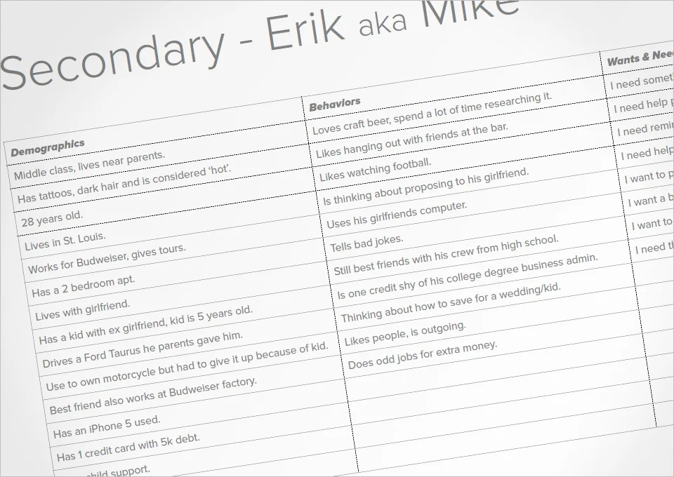
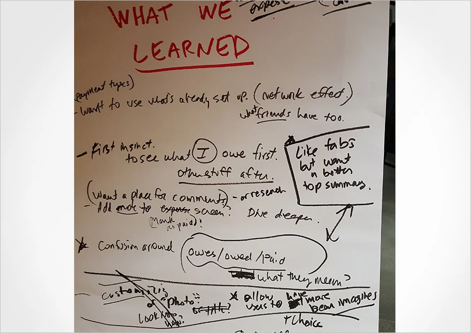
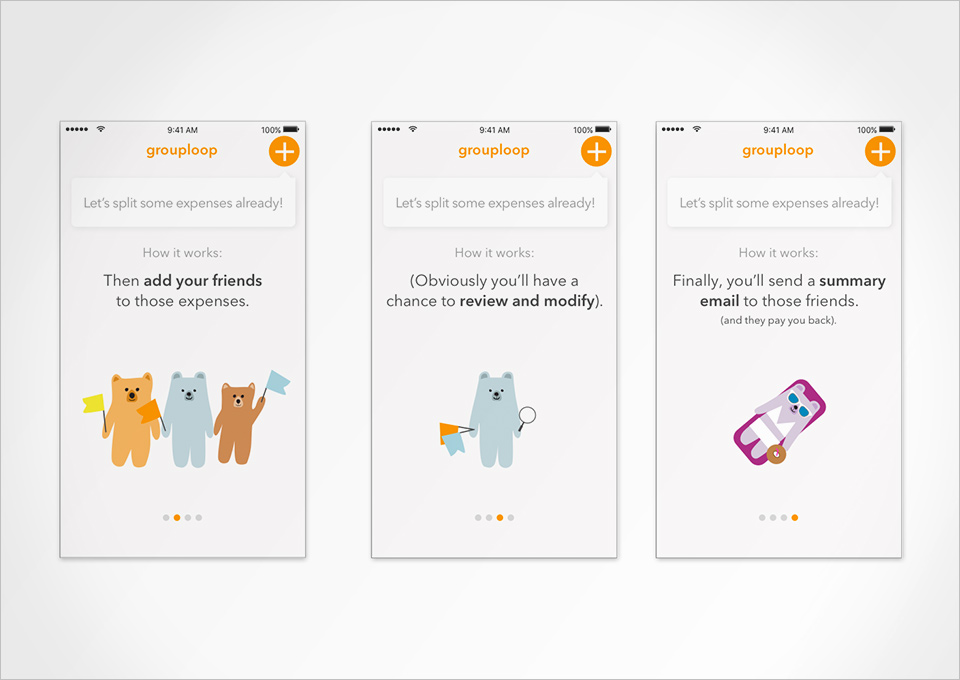
When I came on board, the team was missing some key tools needed to keep our design decisions user centric. We needed to do a bit of catching up, so we kicked it off by working together to create a mission statement. Next I lead the team in a session to craft a few personas. I facilitated, using the 4 quarters method with a focus on wants and needs.
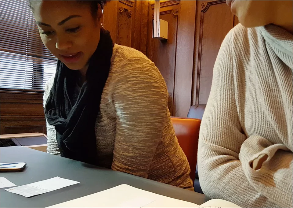
I also implemented a cadence of 2 week design sprints that included user research. (Design stayed 2 sprints ahead of the engineers.) There were also 2 tracks. The "big rocks", and the "small rocks". The big rocks consist of a new flow or feature that need a "gut check" with users several times before moving it into grooming. I would put printouts or clickable prototypes in front of a minimum of 5 users and look for patterns around what was working and what wasn't. If I had time we would iterate and test it again with 5 new users. Small rocks consist of new discoveries or unknowns that were missed or need immediate attention.

The app lived in the Apple store for 3 months before it was decided by the leadership team that it wasn't a viable product for the business. 

Branding Attributes PDF

gl26.jpg
download.jpeg
gl20.jpg
download copy 3.jpeg
gl2.jpg
gl17.jpg
gl3.jpg
download copy.jpeg
gl6.jpg
download copy 2.jpeg

Make Me Move Project


THE ASK:
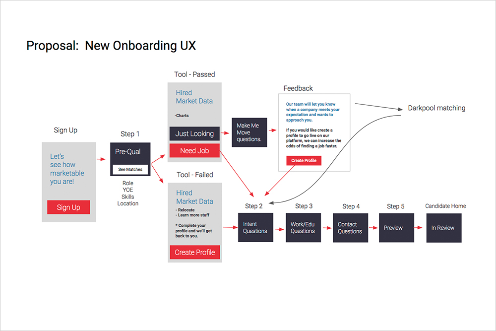
The learnings from research were: some users are just ‘exploring their options’ which leads to a large number of candidates on the platform with low intent to change jobs. I was asked to come up with a separate user experience to for this group.

MY ROLE:
Journey Map, Interaction Design, Visual Design

I developed the user flow, and interaction designs as well as the visual design. 

DEEP DIVE:
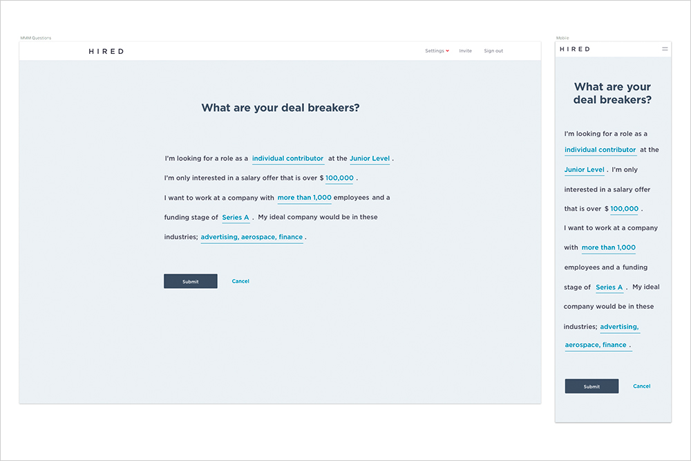
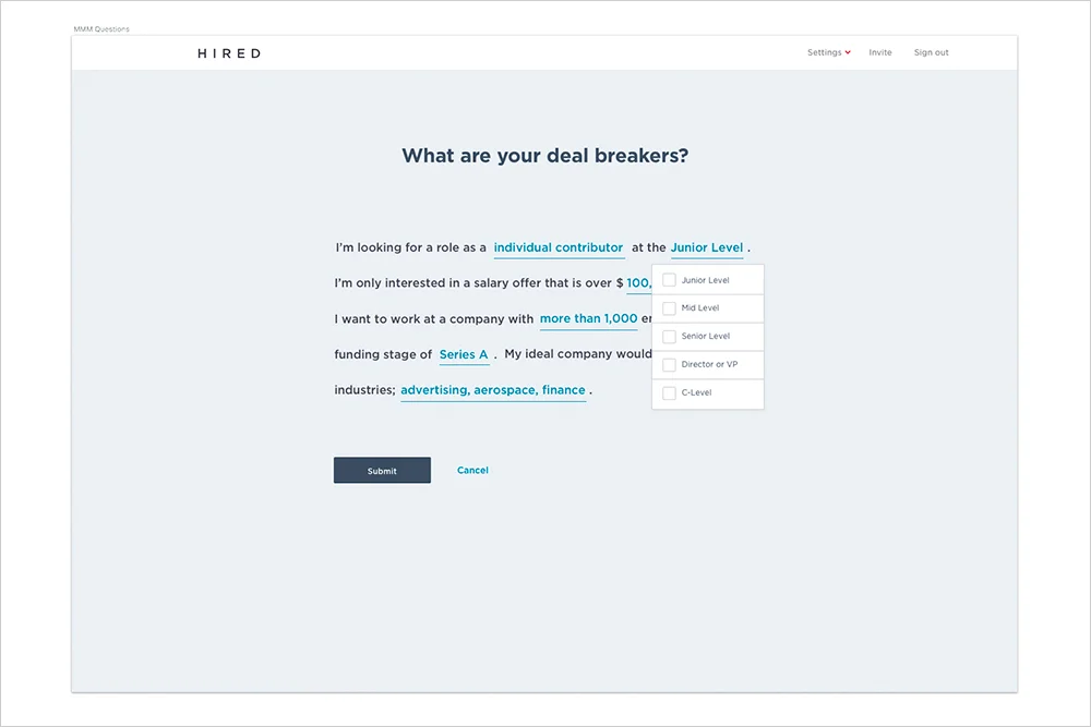
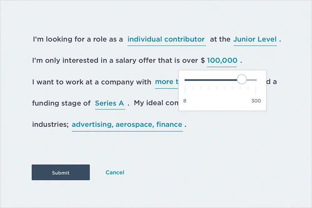
I came up with the concept of asking deal breaker questions as a way to weed out low intent candidates. I did this by asking the user if they need a job now or are they just looking. From there I used the natural language method of asking what it would take for them to leave their current job. (These questions come from research we did upfront.) Natural language is proven to improve completion rates by 20%.

This project has not shipped yet.

mextra.jpg
m1.jpg
m2.jpg
m3.jpg

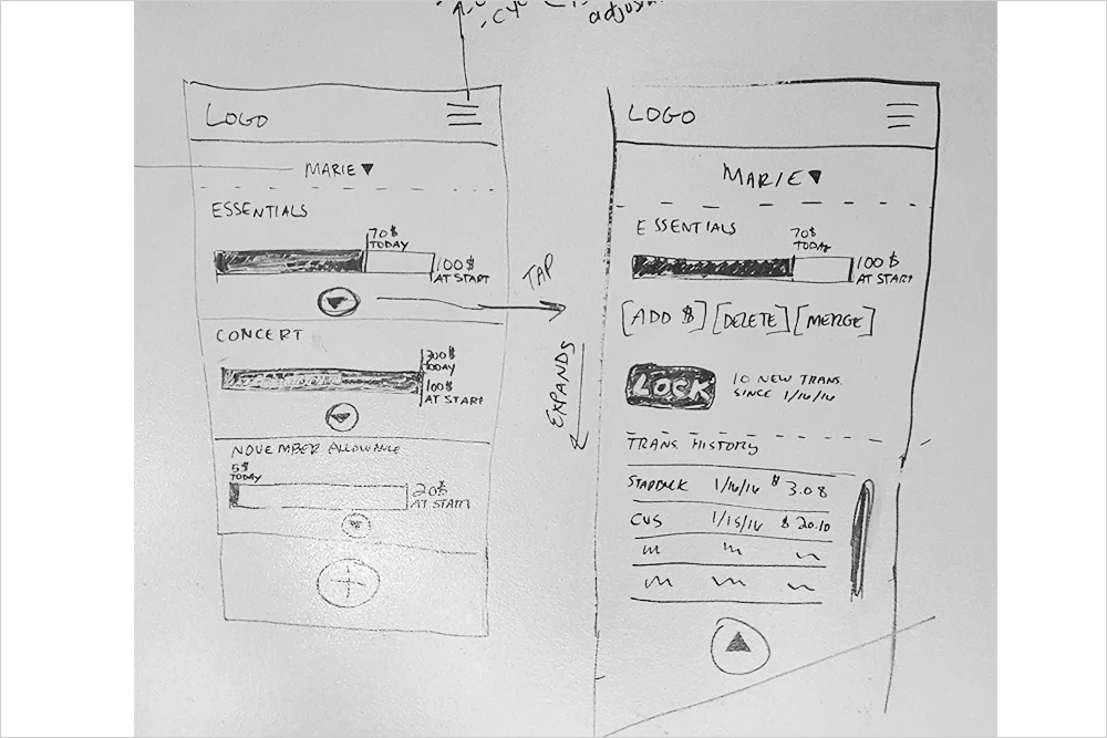
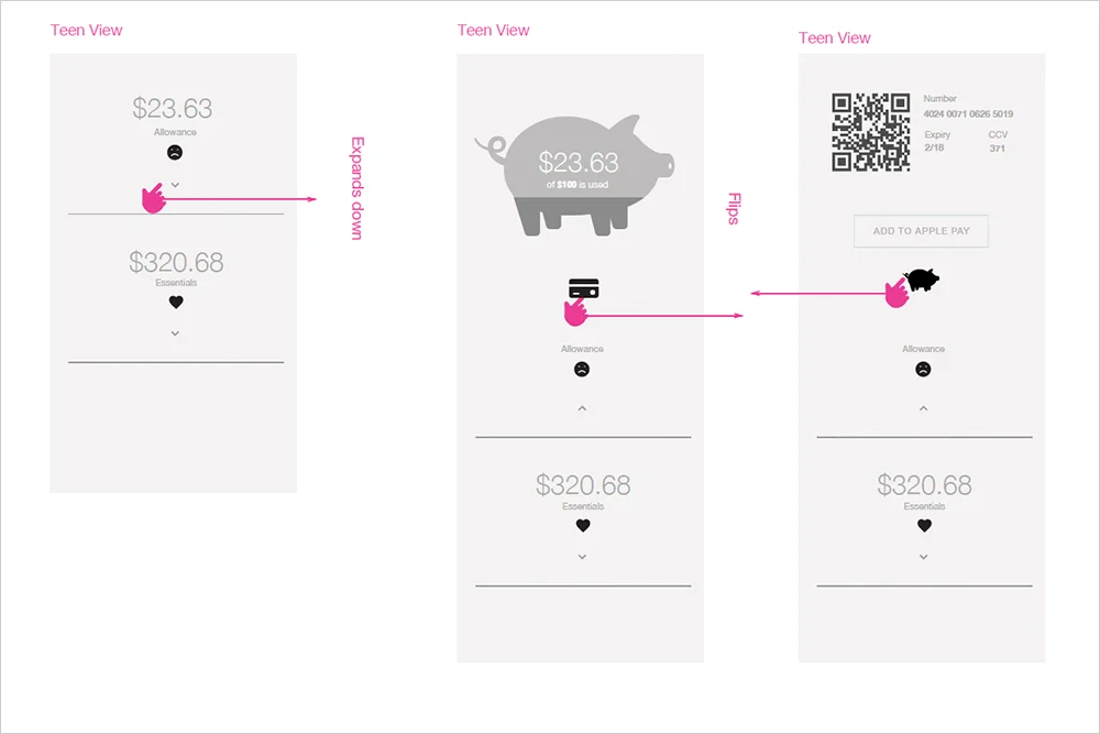
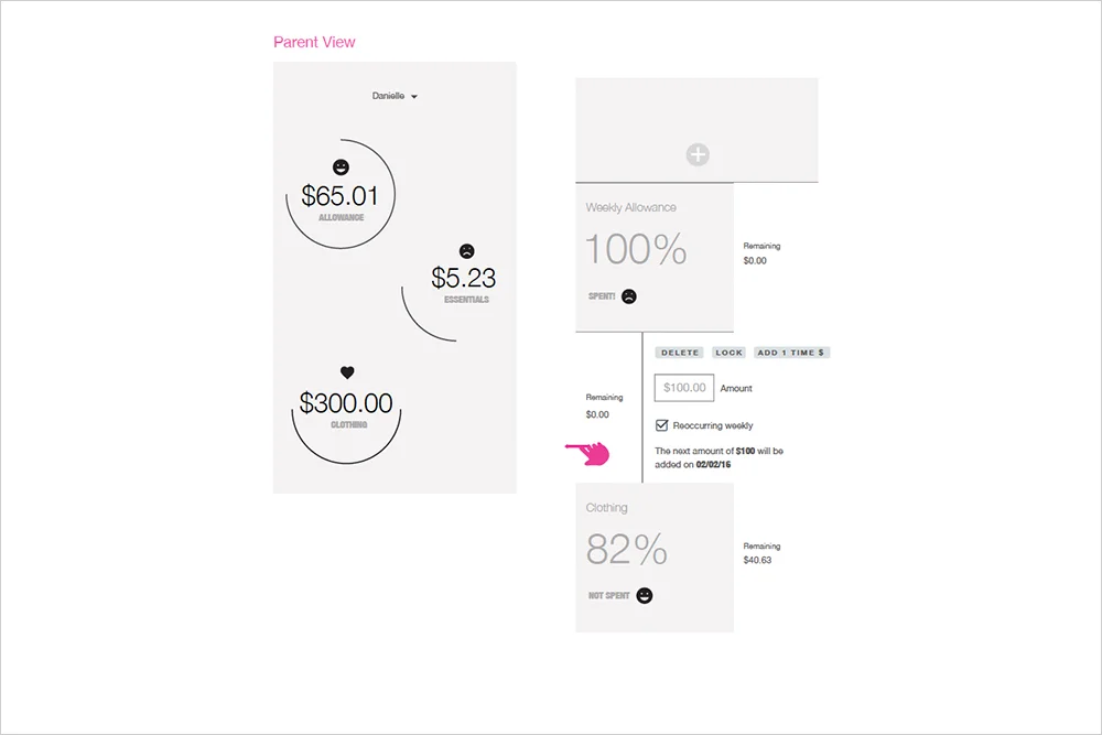
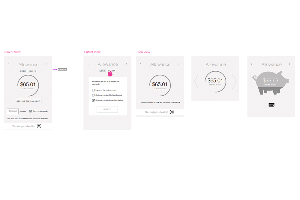
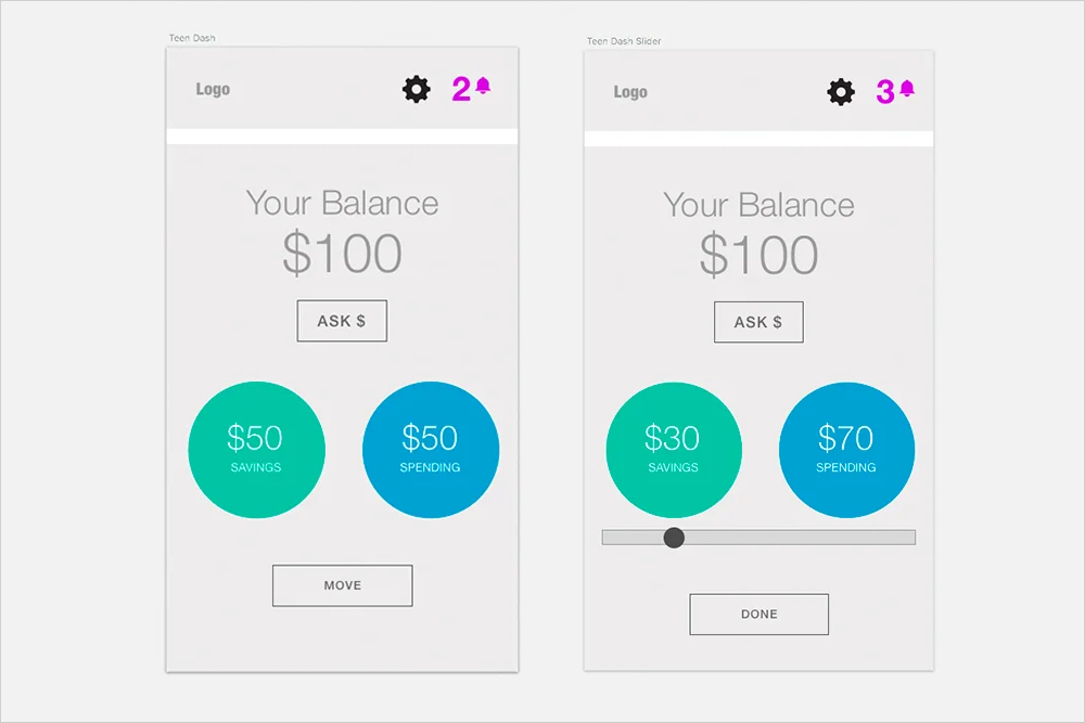
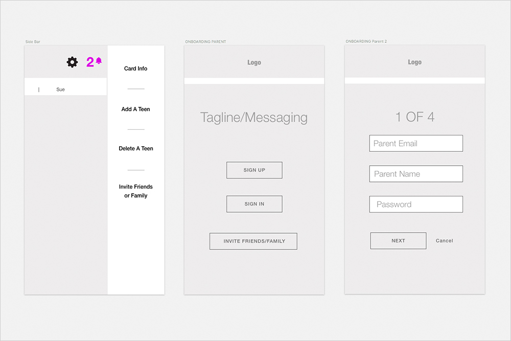
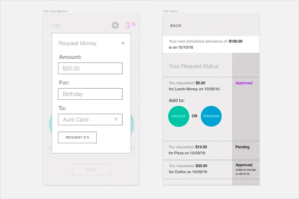
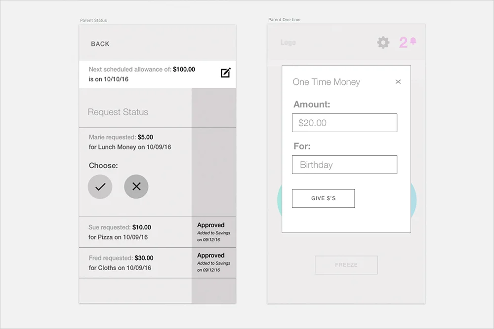
Kids Savings App


THE ASK:
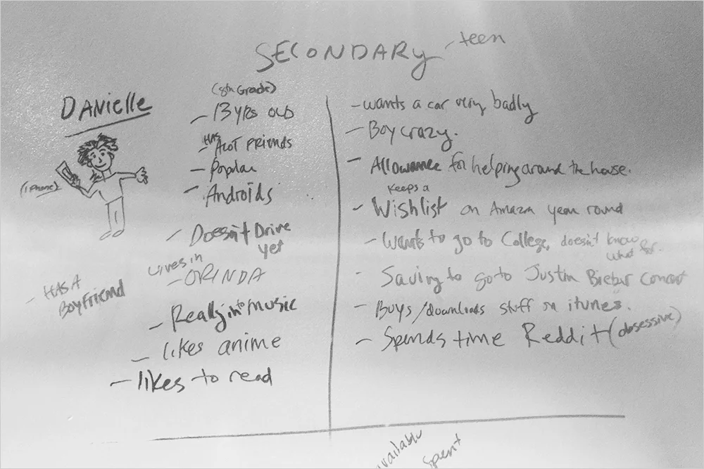
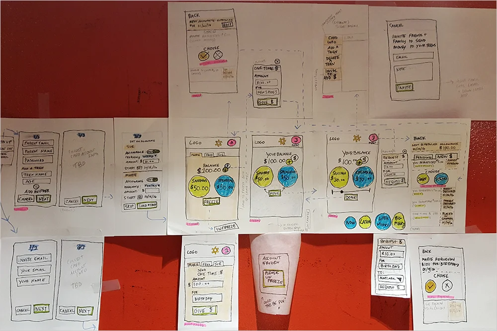
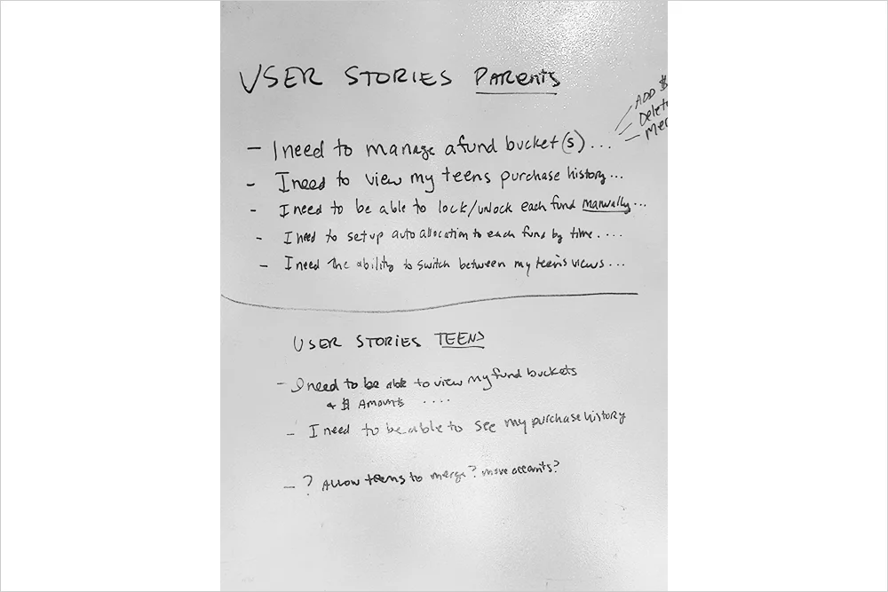
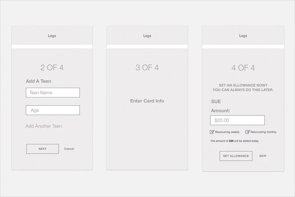
Create a tool to help parents and kids/teens exchange and use their money. Business goal was to increase kid/teen account openings. *We needed to understand what the users goals were.

MY ROLE:
UX Strategy, Interaction Design, Visual Design

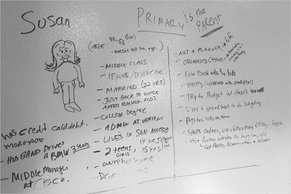
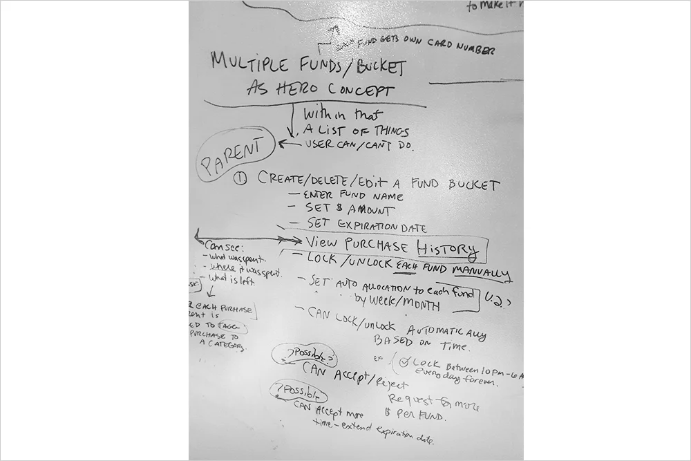
I worked with a researcher who created a 2 sided research plan. One for parents and one for teens/kids. I synthesized the findings and lead a strategy workshop to figure out proto-personas, and an MVP. Then I created 3 different interaction/visual design directions, and worked with the team to narrow down to one low fidelity version.

This project was taken over by another team.

N2.jpg
N3.jpg
N4.jpg
N5.jpg
N6.jpg
N7.jpg
N8.jpg
t2.jpg
t1.jpg
t2 2.jpg
N11.jpg
N1.jpg
N12.jpg
N10.jpg
N9.jpg
N13.jpg

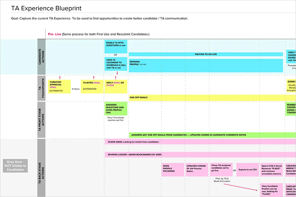
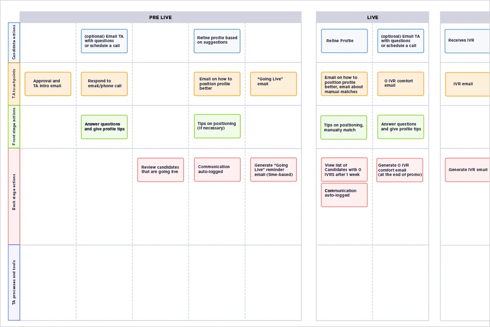
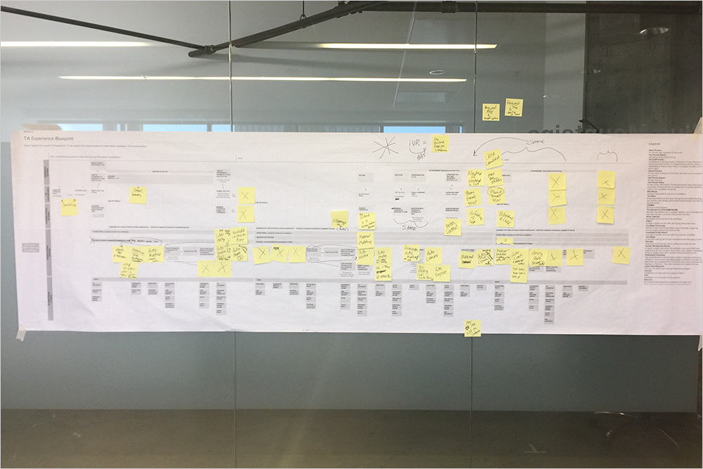
Talent Associate Service Design Map


THE ASK:
Help the talent associate team come up with a 2018 roadmap. 

MY ROLE:
Service Design Mapping

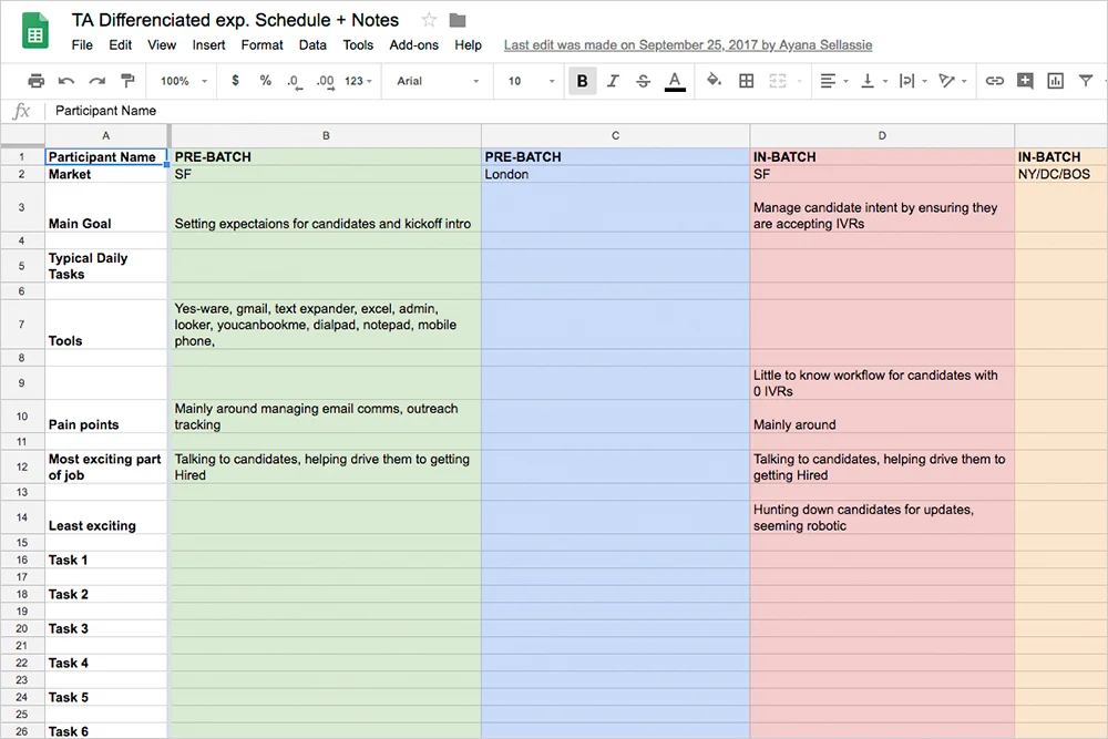
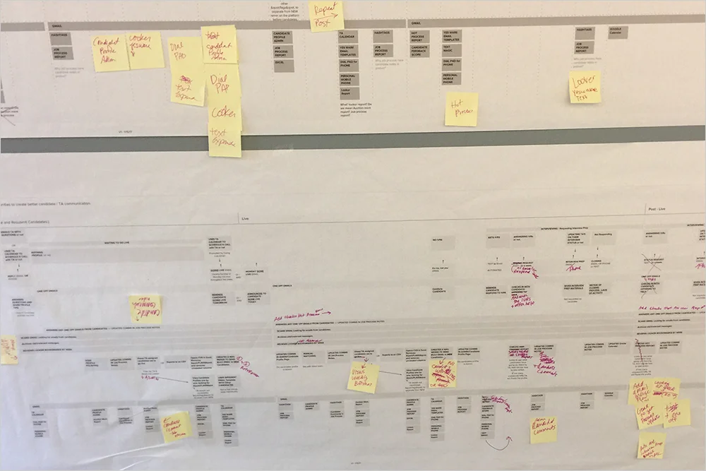
My approach was to use a service design map. I synthesized the internal research findings to create the map. I lead several workshops to ‘true up the content’ and then lead a team session to find the problems to solve. My final task was to create the future state of the service map. The talent associate team went on to create the roadmap they needed for 2018 using the maps.

2.jpg
4.jpg
1.jpg
5.jpg
3.jpg

Console

Story coming soon…

Home.png
list.png
comms.png
benefits.png

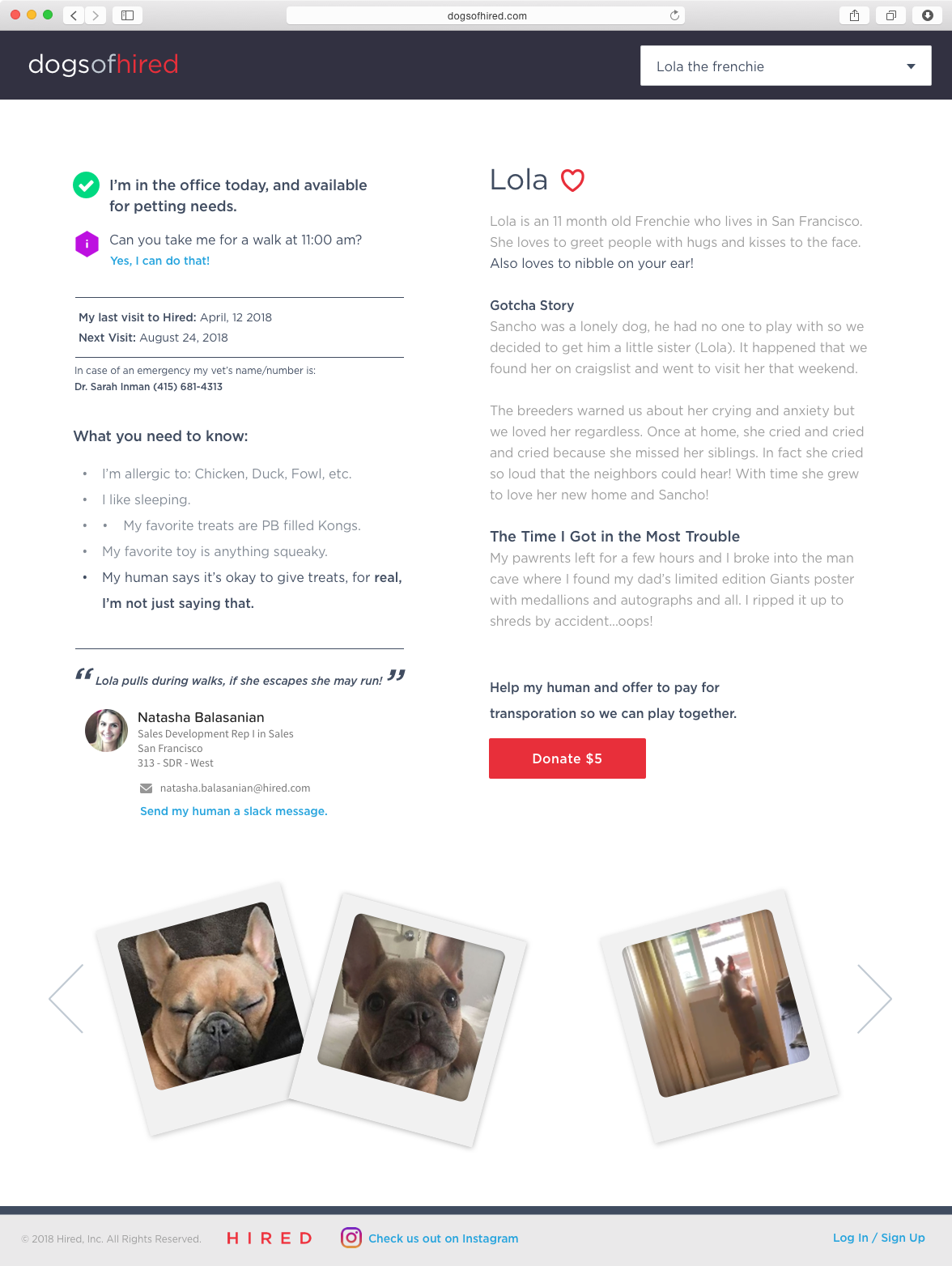
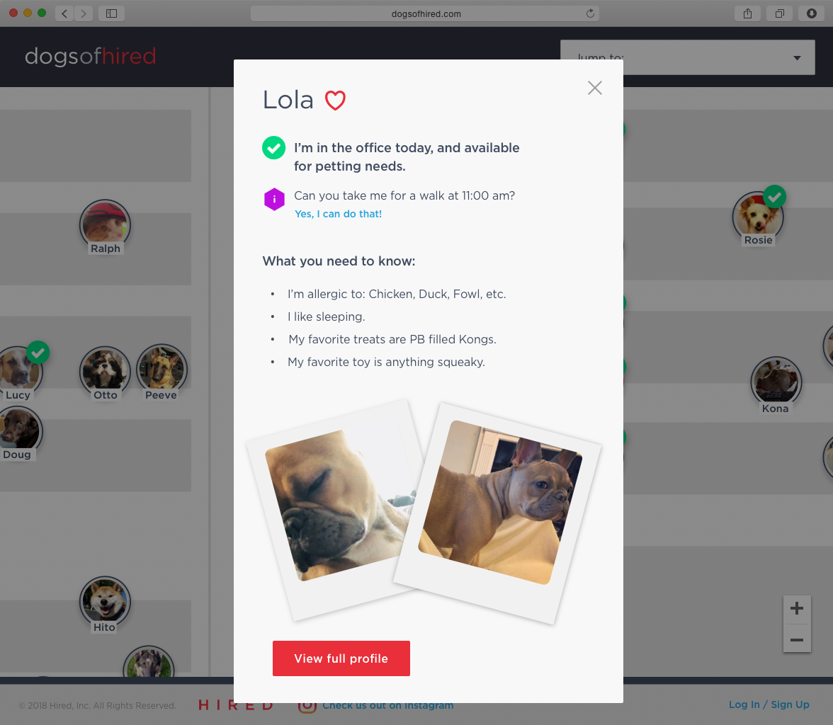
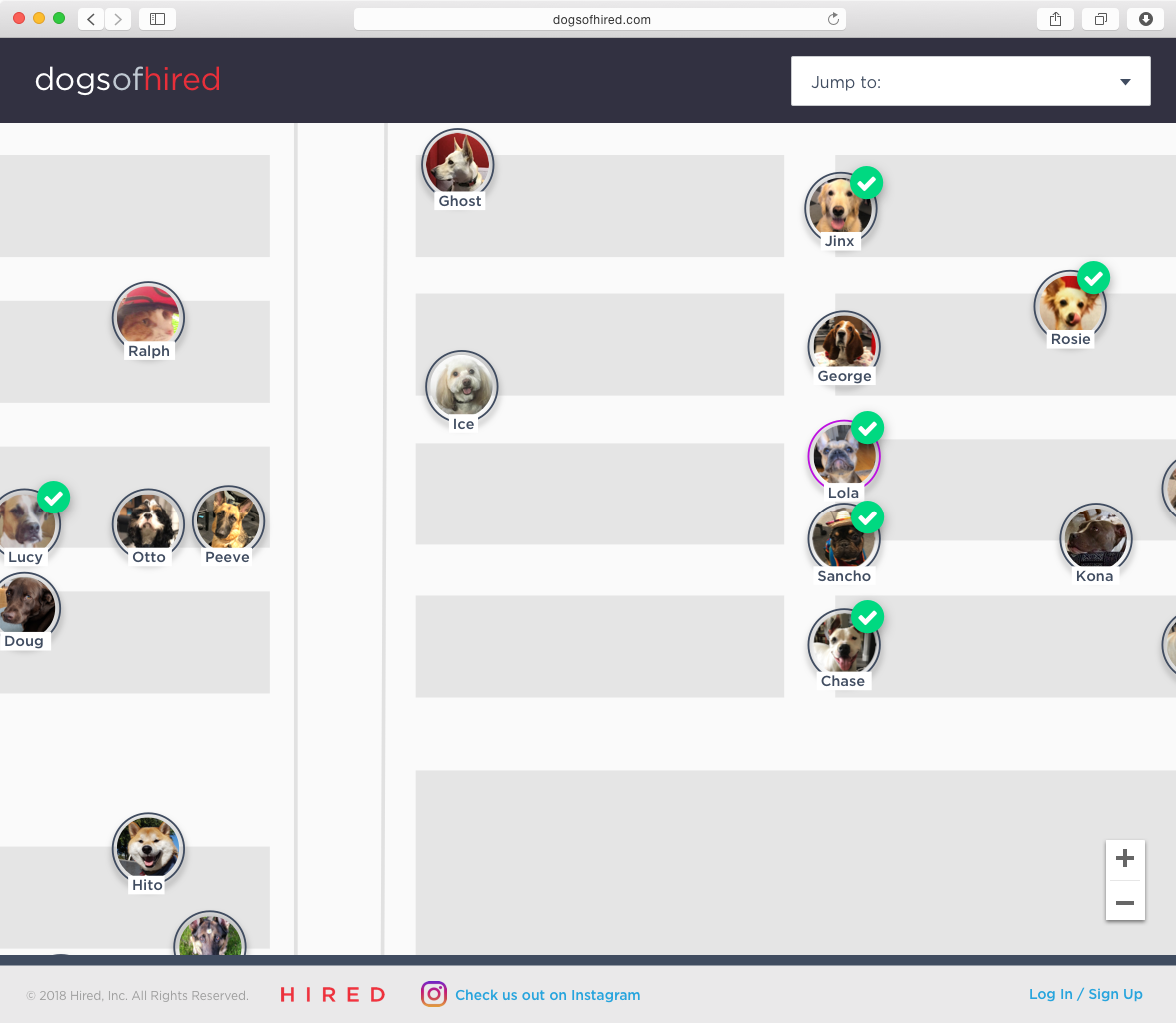
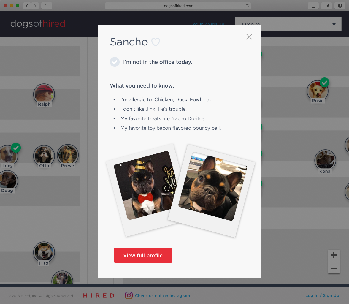
Dogs Of Hired Website

Hackathon project, story coming soon.
View PDF here

DOH_home_0816.png
DOH_Lola_Page_0816.png
DOH_mini_Lola_0816.png
DOH_mini_Sancho_0816.png
prev / next
Back to Design Work (1993-2023)
Screen Shot 2020-06-14 at 3.19.04 PM.png
0
Leadership
Peak_End.jpg
0
Strategy
adidas2.jpg
0
Art Direction
13
Reserve Credit App
5
First Use Project
15
Invoice Tracker App
3
Interview Request Project
20
360 CAFE APP
8
Jabba Interview App
10
GroupLoop Expenses App
4
Make Me Move Project
17
Kids Savings App
5
Talent Associate Service Design
4
Console
4
Dogs Of Hired Website
uxc-badge.png
 

Copyright ©2026 Kelly Gagnon. All Rights Reserved.